CssLessons
Teaching CSS, the right way.
Navigation ☰
History
Origin of CSS
Tim Berners-Lee created HTML in 1991, which would go on to completely revolutionize the world.
Early on, HTML documents were essentially scientifics documents shared among governments and organizations because that is why it was originally developed, but the problem of sharing and linking information across computers wasn't limited to just scientists.
Students, journalists, and hobbyists all had the same problem and now there was this wonderful tool in place that even non-programmers could use and so you saw the World Wide Web implemented and completely take off.
But people using HTML who wanted to be more artistic in their expression found that they were limited in how they could format their documents. Overtime, CSS emerged as the best way to format and style HTML documents.
Evolution
In 1994, Håkon Wium Lie proposed the idea of Cascading Stylesheets (aka CSS). There had already been attempts at giving people the ability to style their documents, but they were either too tightly coupled to the markup syntax that HTML used, too verbose to practically be used, or just didn't solve the needs that, quite frankly, people didn't even know they had.
Then in 1996, after a couple of years of trying to get something built, the first version of CSS called CSS1 was released.
C Style Syntax
Unlike HTML which uses a markup style syntax, CSS uses a C based syntax.
I'm not going to go into too much detail here, but you'll see how CSS uses semi-colons as line terminators and curly brackets to hold blocks of code.
This dramatic syntax difference between HTML and CSS is purposeful and not all that surprising.
Some of the early web developers were traditional programmers and were already used to writing C code, but at the same time, the C style syntax makes it easy for both programmers and non-programmers to understand.
There's also the issue of conflicts. Since HTML allows you to embed CSS, imagine the conflicts that could pop up if CSS used a similar markup syntax that HTML uses. How would the browser be able to tell when it is rendering HTML and when it is rendering CSS. Ambiguity is a terrible thing in programming languages.
Finally, and perhaps the biggest reason, is that the C style syntax makes it very easy for browsers to parse.
Browser Wars
The first major breakthrough was the Mosaic browser back in 1993, three years before CSS was release. This was the first fully graphical browser that ran on multiple operating systems and it made it incredibly easy for non-technical users to access the web.
After Mosaic, Netscape and Internet Explorer both came on the scene in 1995 and both attempted to capture users. When CSS was released the following year, browsers rushed to implement it because it was very clear that CSS was the way of future. Unfortunately, in their haste, different browsers started implementing CSS wrong, incomplete, or in their own proprietary ways.
Netscape's CSS implementation was notoriously awful and Internet Explorer's was still hit or miss. Developers took the practical approach of making their websites flow properly by using tables and it was very common to see "Best viewed in Internet Explorer browser" plastered across the top of websites.
Skip on over to the 2000s with the introduction of FireFox and Opera. Both browsers were (and still are) champions of web standardization. This was the first real push towards a proper implementation of CSS.
Then in 2008, Google released the Chrome web browser. This was really the last big push in standardization because instead of the different browsers pushing for their own proprietary implementation of CSS, most browsers pushed for full support of the official CSS definition (except for Internet Explorer, because IE is absolute garbage).
CSS3 was introduced around this time, but rather than being one huge monolithic definition, it is a living definition released as modules. This pretty much ended the dreaded browser wars of the 90s and 2000s.
The M$ Problem
Microsoft really screwed CSS for nearly a full decade. Internet Explorer 6 was the most used web browser when it was released because Microsoft deployed it with their Windows operating system.
Because Microsoft was in so many pies all at once, they didn't have the time or bandwidth to implement the CSS standards properly. There was also the issue that IE had many proprietary implementations of CSS that literally none of the other browsers implemented.
What this meant was that with 90% of all users using IE that you essentially had to write your code twice. One set of CSS to handle the IE crap and another set to handle all the rest.
At the end of the day, Microsoft designed it so that developers had to build for IE and not the web.
Who Cares?
Reading this today, you are probably asking yourself: "who cares what happened years ago, I am learning now". And it's a good point.
The reason I lay all this out is to show you why good, solid programming principles are important. There is a fairly robust set of standards we follow by today and it is important that you stick with it.
Plus, it's always fun to trash Internet Explorer.
Don't find yourself writing sloppy code or hacking together stuff that just "works", otherwise you'll find yourself back in chaos that was the 90s and early 2000s.
Syntax
Description
CSS is a declarative programming language, that is to say that you define what the end result will be instead of providing step-by-steps on how to achieve it.
The first part is to define a selector, start a grouping, then define key/value pairs separated by semi-colons.
I will be going over all of this later on, but for now think of a selector as a reference to one or more elements.
Example
The following is an example of defining a CSS rule for every paragraph element so that their text color is red and font size is exactly 10 pixels:
p {
	color: red;
	font-size: 10px;
}
With this example:
- p: this is the selector
- { and }: the opening and closing brackets starts/stops the rule
- color and font-size: these are the properties of the elements that will be styled
- red and 10px: these are the values assigned to the properties
Notice that the key/value pairs, aka declarations, are formatted so it is: {key}: {value}. This will also be discussed later, but keys should not have any whitespace, this is why we have "font-size" instead of "font size".
Also notice that the declarations are separated by semi-colons. This is how CSS knows when a declaration's value has stopped since the values can contain whitespace.
Where Does It Live
CSS can go in a few places:
- Inline elements via the style attribute.
- In documents via the style element.
- In their own files, referenced via the link element.
Inline Styling
Styling can be applied directly to HTML elements by using the style attribute on the desired element.
For example:
<p style="color: red; font-size: 8px">This paragraph is red and probably smaller.</p>
<p>This paragraph has no custom styling.</p>
As a general rule it is not a good idea to use inline styling. One of the main benefits of CSS is that it can be applied to many elements and to many documents. But by embedding it inline, you completely give that up.
Not to mention that by using inline styling you tightly couple the HTML to the CSS, which is generally an anti-pattern.
Document Styling
Styling can be applied to the entire document by creating a style element and defining the styles in it.
For example:
<!DOCTYPE html>
<html lang="en">
  <head>
    <title>Document Styling Example</title>
    <meta charset="UTF-8" />
    <meta name="description" content="Teaching CSS, the right way." />
    <meta name="author" content="David Day." />
    <meta name="viewport" content="width=device-width, initial-scale=1.0" />
    <link rel="icon" href="favicon.ico" type="image/x-icon" />
    <!-- style element -->
    <style>
    p {
      color: red;
    }
    </style>
  </head>
  <body>
    <!-- this paragraph will be red -->
    <p>Hello world!</p>

    <!-- so will this one -->
    <p>How are you?</p>
  </body>
</html>
In this example, every paragraph in the document will be red.
This still isn't the most ideal approach though because you are still coupling the HTML file to the CSS styles.
External Stylesheets
The best way to define and use CSS is to create a .css file and then reference in the necessary HTML documents.
For example, assume we have this file is located at /style.css:
p {
  color: red;
}
And this file is located at /document.html:
<!DOCTYPE html>
<html lang="en">
  <head>
    <title>Document Styling Example</title>
    <meta charset="UTF-8" />
    <meta name="description" content="Teaching CSS, the right way." />
    <meta name="author" content="David Day." />
    <meta name="viewport" content="width=device-width, initial-scale=1.0" />
    <link rel="icon" href="favicon.ico" type="image/x-icon" />
    <link rel="stylesheet" href="styles.css" /> <!-- linked stylesheet -->
  </head>
  <body>
    <!-- this paragraph will be red -->
    <p>Hello world!</p>

    <!-- so will this one -->
    <p>How are you?</p>
  </body>
</html>
Now any document that references style.css will be able to use its style.
Also, before moving on, notice that we do not use any HTML inside the CSS file.
In Your Head
Great, now I have The Cranberries stuck in my head.
You might have noticed that both the style and link examples above both went in the head element. This was on purpose because technically, they could have gone in the body.
The reason for this is because of semantics and how the document loading lifecycle behaves.
Semantically, the head element holds information about the document while the body element holds the content that users see and interact with. Since link and style elements hold information about how the document should look, then logically they belong in the head element.
The Lifecycle
Then there is the document lifecycle. Basically, browsers will do the following when loading an HTML document:
- Parse the HTML markup into an in-memory model called the DOM
- Parse the CSS into an in-memory model called the CSSOM
- Combine the DOM and CSSOM to determine the styling
- Start rendering the document to the user
Since the head element is interpreted before the body element, the browser knows ahead of time how to style the elements.
What happens when you put a styling in the body is you start to see "flashes" where elements will be briefly unstyled then out of no where they get styling. Or, even worse, sometimes the styling doesn't get applied at all.
Just know that best practice is to always define your styles in the head element.
Whitespace
Description
CSS completely ignores whitespace outside of what is used in the values.
For example, this:
p
{
  background-color: black;

  color: gold;

  font-size: 10px;
}
Will be read exactly the same as this:
p { background-color: black; color: gold; font-size: 10px; }Minification
The fact that CSS ignores whitespace is actually very beneficial.
If you have a stylesheet that is incredibly long, you can "minify" the code, either manually or using a tool, to compress the overall size.
The reason why this works out in our favor is because of bandwidth. Sometimes, individuals might be in locations where they have bad internet service and so it takes longer to pull files down from the server. By minifying CSS, we can lower the necessary bandwidth to pull down the file but still have it work exactly the same.
The example above is fairly trivial, but realistically this could have a big impact. Assume your unminified file comes in at 240kb and after minification it 165kb, that's a reduction of about 30%. When you're looking at huge number of requests per day, this really starts to add up. Using that example, 75kb saved per request spread out over 100,000 requests translates to 7.5gb of bandwidth saved.
Prettifier
As a beginner, I doubt you'll need to be minifying your code. However, if you view many production ready websites, you may see that their filename is actually something like: style.min.css
This naming convention typically signals to developers that they have minified the CSS.
Typically, if you are going to offer a minified version, then you'd keep both the unminified version as {{filename}}.css and the minified version as {{filename}}.min.css.
While minified code is naturally harder to read because it all runs into one another, most browsers will provide a "prettifier" tool that will format minified CSS in such a way that makes it easier to read.
Comments
Description
Comments allow you to write text that the browser will ignore.
Comments have many use cases. Some use cases are:
- Indicate who wrote a piece of code
- Explain what a block of code does in plain English
- Indicate where a section starts and stops
Comments can appear anywhere in your CSS and are simple to use.
Syntax
Remember that CSS had a lot of inspiration from the C programming language, and its comments are no different.
Use the forward slash and star/asterisk character to start a comment and then a star/asterisk character and forward slash to end a comment:
/* I'm a comment */Comments can even stretch multiple lines:
/*
   Hello world!
   I'm a comment
   Spread across many lines
*/
A Word To The Wise
Be careful with comments! Because CSS has no compilation step, anyone can view your code straight from the browser. Just because a comment containing sensitive information wouldn't render in the browser (e.g., passwords, API keys, or private notes), savvy users can still see it.
For example, this would be a big no no:
/* TODO: production password is Abc123! */Seem Familiar
Does this content look similar to you? If it doesn't, then I highly recommend that you checkout my other website, HtmlLessons (opens in a new tab).
Debugging
Description
If you haven't already, then I highly suggest you checkout my other website's lesson on debugging HTML (opens in a new tab).
Much of what I wrote there will be directly applicable to debugging CSS.
Styles
Open the Elements tab of your browser's developer tools and typically you will see a side panel with several additional tabs.
The first tab is the "Styles" tab and this will show you every style being applied to a specific element along with a hyperlink that brings you directly to the style in question.
For example, right-click and click on inspect this element for this sentence. Under the Styles tab, you won't see any inline styles but you will see styles being pulled in from the library I'm using.
Computed
The second tab in the side panel is the "Computed" tab. This will show you the final computed values of the styles being applied on a specific element.
This is particularly useful because sometimes we will use values that are relative. For example, the em size (we will go over it in more detail later) is relative the font's pixel size. The computed tab will show the final calculated pixel size for something that uses em.
My 2¢
Just like HTML, CSS is less about fixing "bugs" in the traditional sense and more about carefully checking your work for small mistakes.
The best way to debug is to strip away all relevant code and slowly add it back until you recognize what went wrong.
This may be tedious, but such is the life of a programmer.
Simple Selectors
Description
CSS selectors are how you tell the browser: "Hey, style these specific elements".
Simple selectors are the ones that target elements directly, in the next couple of chapters we will be going over more advanced concepts.
Type Selector
Perhaps the most straightforward selector that CSS has to offer is the type selector. You have already seen some examples in previous lessons of using a type selector.
The type selector is just the name of an HTML element.
For example:
/* style every h1 element */
h1 {
  background-color: rebeccapurple;
  color: gold;
}
The example above would style every h1 element in the HTML document.
ID Selector
Another very simple selector is the ID selector.
The ID selector will start with the pound or hash sign, followed by the element's ID value.
For example, assume we have the following markup:
<p id="foo">Hello world!</p>To style this element using the ID selector, it would look like this:
#foo {
  color: blue;
}
Important: HTML elements should have unique IDs, but because the language is so forgiving, we cannot always rely that the id selector will only ever target a single element.
Class Selector
Similarly to the ID selector, the class selector uses an HTML attribute to apply styles to.
The class selector will start with a dot, followed by the elements' class value.
For example, assume we have the following markup:
<p class="foo bar">Hello world!</p>To style this element using the class selector, we could use either one of these rules:
.foo {
  color: blue;
}

.bar {
  background-color: yellow;
}
Ordering Matters
Notice in the example above that the paragraph element has two classes and so we can use two different rules to style the same element. Technically we could 3 different rules just based on the different selectors you already know about because we can use the type selector or two different types of class selectors.
But what happens if an element matches multiple selectors that style the same properties?
For example, this markup:
<p class="foo">Foo</p>
<p class="bar">Bar</p>
<p class="foo bar">Hello world!</p>
With this styling:
.foo {
  color: blue;
}

.bar {
  background-color: yellow;
  color: red;
}
In this example:
- The first paragraph would have only blue coloring.
- The second paragraph would have red coloring and a yellow background.
- The third paragraph would have red coloring and a yellow background.
The reason why the third paragraph would match the second is because the order in which the rules were defined.
For example, if we swap the rules around:
.bar {
  background-color: yellow;
  color: red;
}

.foo {
  color: blue;
}
Then in this example:
- The first paragraph would have only blue coloring.
- The second paragraph would have red coloring and a yellow background.
- The third paragraph would have blue coloring and a yellow background.
The order in which CSS rules appear is very important. You should keep this in mind when debugging when trying to figure out why a style isn't being applied.
Universal Selector
The universal selector is a little different than the rest because it is more of a generic "catch-all" selector.
The universal selector is simply the star or asterisk character.
For example:
* {
  font-size: 10px;
}
In this example, every element in the document would have a font-size of 10 pixels.
Sharing Rules
You can define one set of rules that apply to multiple selectors by separating the selectors by commas.
For example:
h1, h2, h3, h4 {
  color: orange;
}
In this example, every h1, h2, h3, and h4 element would have orange text. In other words, they all share the same rule.
Exercise
Given the following HTML:
<h1>Simple Selector Practice</h1>

<p id="special">This paragraph has a unique ID.</p>

<p class="note">This is a note.</p>
<p class="note highlight">This is an important note.</p>

<div class="highlight">Highlighted container</div>

<span class="note">Inline note</span>
Attempt to do the following:
- Style all paragraph elements.
- Style only the element with the id "special".
- Style all elements with the class "note".
- Style all elements with the class "highlight".
- Style every element.
Don't worry about giving it any styles since we haven't covered the different key/value pairs yet. For now, just include a comment with which elements will be styled.
Show Exercise Code
p {
  /*
     <p id="special">This paragraph has a unique ID.</p>
     <p class="note">This is a note.</p>
     <p class="note highlight">This is an important note.</p>
  */
}

#special {
  /*
     <p id="special">This paragraph has a unique ID.</p>
  */
}

.note {
  /*
     <p class="note">This is a note.</p>
     <p class="note highlight">This is an important note.</p>
     <span class="note">Inline note</span>
  */
}

.highlight {
  /*
     <p class="note highlight">This is an important note.</p>
     <div class="highlight">Highlighted container</div>
  */
}

* {
  /* universal selector */
}
Chaining Selectors
Description
While selectors are fairly straightforward, they are incredibly powerful and can do many things depending on how they're configured.
In this lesson, we will be discussing how to chain together selectors.
Combining
Assume for a second we have the following markup:
<h2 class="foo">Title</h1>
<p class="foo">E lorem ipsum, blah blah blah.</p>

<h2>Title 2</h1>
<p class="foo">Hello world.</p>
What would you do if we wanted to style the first h2 element, but none of the other elements?
- We can't use the type selector because then it would apply to both h2 elements.
- We also can't use the class selector because then it would apply to the first h2 element and both paragraphs.
- The easiest solution would be to give the h2 element an id, but some times we don't have any control over the HTML. So what then?
One option would be to combine the type selector with the class selector.
For example:
h2.foo {
  color: rebeccapurple;
}
In this example, we are saying that we only want to style h2 elements with the "foo" class. Using the markup above, the rule would only apply to the first h2 element.
A real-world example would be a class named "monospace", for example:
.monospace {
  font-family: monospace
}

code.monospace {
  font-size: 10px;
}
In this example, any element with the "monospace" class will use a monospace font family. Then any code element with the "monospace" class will use both a monospace font family and a font size of 10 pixels.
Keep in mind that while in these examples we combine the type and class selectors, we can use pretty much any combination.
For example, this one combines two class selectors:
.foo.bar {
  color: gold;
}
The example above would apply to any element with both classes "foo" and "bar".
Sibling Elements
There are two types of selectors you can use to style sibling elements: subsequent sibling and next sibling selectors.
Subsequent Sibling Selectors
The subsequent sibling selector is a tilde character, for example:
h2 ~ p {
  font-size: 15px;
}
This example would style every paragraph element that is a sibling after an h2 element.
<h1>Title</h1>
<p>First paragraph</p>

<h2>Sub-Title</h2>
<p>Second paragraph</p> <!-- this one, -->
<p>Third paragraph</p> <!-- this one, -->
<div>
  <p>Fourth paragraph</p>
</div>
<p>Fifth paragraph</p> <!-- and this one -->
In this markup, only the second, third, and fifth paragraphs would be styled using the rule above.
- The first paragraph doesn't get the style is because it appears before the h2 element.
- Unfortunately, this is a hard limitation of CSS.
- You cannot traverse the DOM backwards using CSS selectors.
- The second, third, and fifth paragraphs get the style because they appear after the h2 element and all share the same parent.
- Even though the fifth paragraph is separated by a div, it still shares the same parent and it is defined after the h2.
- The fourth paragraph doesn't get the style because it is not a sibling of the h2 element.
Next Sibling Selectors
The next sibling selector is a plus sign character, for example:
h1 + p {
  font-size: 15px;
}
This example would style only the first paragraph that immediately follows an h1 element.
<h1>Title</h1>
<p>First paragraph</p> <!-- only this one -->
<p>Second paragraph</p>
<p>Third paragraph</p>

<h1>Title</h1>
<div>
  <p>Fourth paragraph</p>
</div>
In this markup, only the first paragraph would be styled using the rule above.
- The first paragraph gets the style because it is the immediate sibling following the h1 element.
- The second and third paragraphs don't get the styling because they do not immediately follow an h1 element (they're preceding siblings are p elements).
- The fourth paragraph doesn't get applied because it isn't even a sibling of the h1 element.
Descendant Elements
There are two types of selectors you can use to style descendant elements: the child selector and descendant selector.
Child Selector
The child selector is the greater than symbol, for example:
article > h2 {
  color: green;
}
This example would style any h2 elements that are direct children of article elements.
<article>
  <h2>Article Heading</h2> <!-- only this one -->
  <p>E lorem ipsum...</p>
  <section>
    <h2>Section Heading</h2>
    <p>Hello World!</p>
  </section>
</article>
In this markup, only the first h2 element would be styled using the rule above.
- The first h2 element gets the style because it is a direct child of the article.
- The second h2 element doesn't get the style because it is not a direct child.
- Even though the second h2 element is a descendant, it still doesn't get the style.
- This is because the child selector is only applicable to direct children of an element.
Descendant Selector
The descendant selector is just a single space separating the two elements, for example:
article h2 {
  color: green;
}
This example would style any h2 element that is a descendant of an article.
Using the same example from the child selector above, both h2 elements would have the style applied.
It doesn't matter how deep the DOM goes either, it can be 50 million levels deep and the style would still apply. For example:
<article>
  <h2>Child</h2>
  <section>
    <h2>Grand Child</h2>
    <div>
      <h2>Great Grand Child</h2>
      <div>
        <h2>Greatx2 Grand Child</h2>
        <div>
          <h2>Greatx3 Grand Child</h2>
          <div>
            <h2>Greatx4 Grand Child</h2>
            <div>
              <h2>Greatx5 Grand Child</h2>
            </div>
          </div>
        </div>
      </div>
    </div>
  </section>
</article>
Every one of the h2 elements in the example above would get the style.
Exercise
Given the following HTML:
<article class="post featured">
  <h2 class="title featured">Main Heading</h2>
  <p>Intro paragraph.</p>

  <section class="content">
    <h2 class="title">Sub Heading</h2>
    <p class="note">Important note.</p>
    <p>Regular paragraph.</p>
  </section>

  <h2>Another Heading</h2>
  <p class="note highlight">Highlighted note.</p>
</article>
Attempt to do the following:
- Write a selector that targets only the h2 elements with the class title.
- Write a selector that targets elements with both classes note and highlight.
- Write a selector that targets every paragraph that is a descendant of section.content element(s).
- Write a selector that targets only the first paragraph immediately following any h2.
- Write a selector that targets all h2 elements that appear after the first h2.title.featured element inside the article (subsequent siblings).
As before, do not worry about actual CSS properties. For each selector, simply write a comment listing which elements will be affected.
Show Exercise Code
h2.title {
  /*
     <h2 class="title featured">Main Heading</h2>
     <h2 class="title">Sub Heading</h2>
  */
}

.note.highlight {
  /*
     <p class="note highlight">Highlighted note.</p>
  */
}

section.content p {
  /*
     <p class="note">Important note.</p>
     <p>Regular paragraph.</p>
  */
}

h2 + p {
  /*
     <p>Intro paragraph.</p>
     <p class="note">Important note.</p>
  */
}

h2.title.featured ~ h2 {
  /*
     <h2 class="title">Sub Heading</h2>
     <h2>Another Heading</h2>
  */
}
Pseudo-Classes
Description
A pseudo-class is something added to selectors that let you style an element when it is in a specific state or position.
The symbol used to represent a pseudo-class will be a colon, followed by the class's name.
Typically, pseudo-classes will be applied to interactive elements like anchors, buttons, and inputs.
Display States
There are some elements that change how they are displayed when a user interacts with them.
For example, select elements open a dropdown list, details elements open a previously hidden container, and some inputs (like color and date type inputs) display an interface the user can select a value from.
Since these lessons are designed with beginners in mind, I will only be going over one of the display state pseudo-classes, and that is the open class.
Here is an example of styling a select element using the open pseudo-class:
select {
  color: rebeccapurple;
}

select:open {
  color: gold;
}
When the select is in its default state, the color of the text will be purple. But as soon as the select is opened, the color of the text changes to gold.
It is important to note that there cannot be any whitespace before or after the colon that identifies that we are using a pseudo-class. Remember that whitespace is actually used as the descendant selector.
Open Pseudo-Class And Descendants
A common use case will be to conditionally style the descendants of an element based on the open pseudo-class.
This can be done by chaining together selectors and using the pseudo-class on the parent element.
For example:
details > summary {
  color: green;
  font-size: 16px;
}

details:open > summary {
  color: black;
  font-size: 22px;
}
In this example, the summary will start off green and have a font size of 16 pixels, but as soon as the details is opened up the summary's text will change to black and the font size will increase to 22 pixels.
Input Pseudo-Classes
The different type of input pseudo-classes target either the state or requirements of a given input.
I will not be going over every different type of input pseudo-class because there are many. However, here are some of the input related pseudo-classes:
- :enabled: Applied when an input is enabled.
- :disabled: Applied when an input is disabled.
- :valid: Applied when an input meets the client-side validation rules.
- :invalid: Applied when an input doesn't meets the client-side validation rules.
- :required: Applied when an input is marked as required.
- :optional: Applied when an input isn't marked as required.
Here is an example of using some:
/* any span immediate following a required input */
input:required > span {
  color: red;
}

/* any disabled input */
input:disabled {
  color: darkslategray;
}
With the first rule, we indicate that the next span sibiling after required inputs will be red and the second rule makes the text color of disabled inputs a dark gray.
Location Pseudo-Classes
These types of pseudo-classes are applied to links or their related targets:
- :link: Applied to anchors that have not yet been visited.
- :visited: Applied to anchors that have been visited.
- :target: Applied to the element which is the target of the document (i.e. the URL fragment matches the element's ID).
Here is an example of using them:
/* any link not visited */
a:link {
  color: blue;
}

/* any link visited */
a:visited {
  color: rebeccapurple;
}

/* element where ID matches fragment */
*:target {
  border-color: black;
  border-width: 1px;
}
Structural Pseudo-Classes
Sometimes you want to target elements based on where they are in the DOM or their specific structure.
There are several different pseudo-classes and each one might have a different usage, but I will go over some of the basic examples.
- :empty: Applies to an element with no children.
- :first-child: Applies to an element that is the first of its siblings.
- :last-child: Applies to an element that is the last of its siblings.
- :first-of-type: Applies to an element that is the first of its siblings and also matches a certain type.
- :last-of-type: Applies to an element that is the last of its siblings and also matches a certain type.
Hacks
Pseudo-classes are used to really hack CSS. I don't mean that in the "Neo in the Matrix" type of way, rather pushing the languages capabilities to the very edge of what they can do.
If you look at my source code (shortcut key Ctrl+U), you may notice a spa.css file being used. Inside this code, I use the target pseudo-class (along with others) to implement a single-page application using only CSS. Traditionally, this could only be done using JavaScript, but people found a way to really push CSS in a way to do incredible things.
For now, don't worry so much about it. I just wanted to show you that you can achieve incredible things with CSS and that pseudo-classes generally play a large part of that.
Colors
Description
Up to this point we haven't gone over any specific styling examples, but starting with this lesson that will change. From here on out we won't be discussing selectors, rather we will be focusing on the actual styling.
There are several properties that use colors, but perhaps the two most common properties are:
- color: The color of the text.
- background-color: The color of the background.
Named Colors
In the original version of CSS, there were only 16 colors defined and for some reason they completely forgot about the color orange.
The original list consisted of:
| Name | Example |
|---|---|
| aqua | |
| black | |
| blue | |
| fuchsia | |
| gray | |
| green | |
| lime | |
| maroon | |
| navy | |
| olive | |
| purple | |
| red | |
| silver | |
| teal | |
| white | |
| yellow |
The way that these named colors are used are to literally use their name. For example:
element {
  background-color: maroon;
  color: fuchsia;
}
Naturally, the list proved to be too small; developers wanted more color options. A couple years later, CSS introduced over 100 more (including orange!).
I would recommend referencing MDN named color article (opens in a new tab) for the complete list of color names.
Programatic Colors
Even with ~160 colors, this still wasn't enough to satisfy the needs of developers and designers. To be quite frank, the limitation set by color names is a bit arbitrary too. After all, we are programmers who can use a combination of zero's and one's that mere mortals cannot comprehend!
The initial release of CSS included two ways to programatically set a color:
- Hexadecimal
- RGB
Hexadecimal
Arguably the most common way to define colors in CSS is to use the Hexadecimal notation, aka hex codes.
Essentially, a hex code will consist of six characters, grouped into three pairs in this format:
#RRGGBBEach pair dictates the level of a specific color. RR represents red, GG represents green, and BB represents orange, just kidding it represents blue.
The values are written in base-16 and range from 00 (none) to FF (full). Take for example these values:
.black-text {
  color: #000000; /* no red, no green, and no blue */
}

.white-text {
  color: #FFFFFF; /* full red, full green, and full blue */
}

.red-text {
  color: #FF0000; /* full red, no green, and no blue */
}

.green-text {
  color: #00FF00; /* no red, full green, and no blue */
}

.blue-text {
  color: #0000FF; /* no red, no green, and full blue */
}
These examples either use the min or max hex value, but to mix and match colors we need to use the full range of values. For example:
.purple-text {
  color: #663399; /* low red, very low green, and medium blue */
}

.orange-text {
  color: #FFA500; /* full red, medium green, and no blue */
}
Hexadecimal Shorthand
There is a nifty shorthand that can be used when both digits of each pair would be identical where you can simply drop one of the digits from each pair.
For example, using the simple examples from above:
.black-text {
  color: #000; /* no red, no green, and no blue */
}

.white-text {
  color: #FFF; /* full red, full green, and full blue */
}

.red-text {
  color: #F00; /* full red, no green, and no blue */
}

.green-text {
  color: #0F0; /* no red, full green, and no blue */
}

.blue-text {
  color: #00F; /* no red, no green, and full blue */
}
RGB
Another way to define colors in CSS is to use the RGB notation.
RGB is similar to hex codes, only instead of using base-16 values we use values from 0 - 255 or 0% to 100%.
For example:
.black-text {
  color: rgb(0, 0, 0); /* no red, no green, and no blue */
}

.white-text {
  color: rgb(100%, 100%, 100%); /* full red, full green, and full blue */
}

.red-text {
  color: rgb(100%, 0%, 0%); /* full red, no green, and no blue */
}

.green-text {
  color: rgb(0, 255, 0); /* no red, full green, and no blue */
}

.blue-text {
  color: rgb(0, 0, 255); /* no red, no green, and full blue */
}
Notice that in the examples above, we either use one or the other. However, you cannot mix and max percentages with number values.
Alpha
Are you an alpha bro?! Yeah, well I'm an omicron persei eight bro. If you have to ask, then you wouldn't get it.
Alpha, other than being a societal label that allows inconsequential men feel better about themselves, is something that CSS supports which represents transparency within colors.
This is done by using the rgba function that is similar to the rgb function used above, only we include a fourth argument to represent the alpha value which ranges from 0 (transparent) to 1 (opaque).
For example:
.transparent-example {
  color: rgba(0, 0, 0, 0.5);
}
In this example, we define a black color with 50% transparency. In practice, this would appear like a light gray color.
The alpha channel is very useful because web pages are built in layers. For example, this paragraph is a child of a section, which itself is a child of a section, which is then a child of the article, and so on until we get to the root element. By being allowed to set the alpha channel value of the color, we can achieve glassy looks or softer backgrounds.
Color Wheels
Don't try to memorize all these color codes. Luckily for us, there are several resources that will provide us with the desired color code.
I recommend using the MDN Color Format Converter (opens in a new tab). This allows you to pick a color and change the opacity and then generate the color code for you.
Demo
Open the demo in a new tab
Exercise
Use the following markup:
<!DOCTYPE html>
<html lang="en">
  <head>
    <title>CssLessons - Colors Exercise</title>
    <meta charset="UTF-8">
    <meta name="viewport" content="width=device-width, initial-scale=1.0">
  </head>
  <body>
    <main>
      <header>
        <h1>CssLessons Colors Exercise</h1>
      </header>

      <article>
        <h2>You Got This!</h2>
        <p>I believe in you! <span id="lil-john">Yeah</span>!</p>
      </article>

      <footer>
        <p>© 1991</p>
      </footer>
    </main>
  </body>
</html>
With this markup:
- Make all heading elements have purple text.
- Make only they footer paragraphs have green backgrounds and yellow text.
- Make the span have a black background and gold text.
- Use whichever convention you prefer: named, hex, or RGB.
Example
Open the example in a new tab
Solution
Show Example Code
h1, h2 {
  color: #663399;
}

/* most explicit used, but it could be simplified in this case */
body > main > footer > p {
  background-color: green;
  color: yellow;
}

#lil-john {
  background-color: rgb(0, 0, 0);
  color: #FFD700;
}
Click on the "Show Example Code" above to show the code I used to create the example.
Units of Measurement
Description
Just like in the real world, CSS offers many different types of units of measurement.
These units of measurements can be split up between two groups:
- Fixed Size: An individual values are not relative to anything else and will represent a static amount.
- Relative Size: An individual value is relative to something and can wildly differ depending on the context.
Fixed Size Units
The following is a list of fixed size units:
| Unit | Name | Value |
|---|---|---|
| cm | Centimeter | 1cm |
| in | Inch | 1in |
| mm | Millimeter | 1mm |
| pc | Pica | 1/6th of 1in |
| pt | Point | 1/72nd of 1in |
| px | Pixel | 1/96th of 1in |
| Q | Quarter-Millimeter | 1/40th of 1cm |
Aside from the pixel unit, all the other units are almost always used when printing stuff. The pixel unit is the most commonly used fixed size unit of measurement when displaying the content in the browser.
The reason for this is because nearly all displays, monitors or mobile devices, ultimately show everything as pixels; basically a pixel corresponds to a single "dot" on the screen.
Relative Size Units
The following is a list of relative size units:
| Unit | Name | Value |
|---|---|---|
| % | Percentage | Relative to the element's parent. |
| em | EM | The width of the letter "M" in a given typeface. |
| rem | Root EM | The width of the letter "M" in a given typeface of the root element (aka the html element). |
| vh | View Height | Percentage relative to the device's height |
| vw | View Width | Percentage relative to the device's width |
Relative size units will make more sense in later lessons, specifically when we discuss the box model, but for now there are some practical examples we can cover.
Let's assume we have the following markup:
<!DOCTYPE html>
<html lang="en">
  <head>
    <title>CssLessons - Units of Measurement Font Size</title>
    <meta charset="UTF-8">
    <meta name="viewport" content="width=device-width, initial-scale=1.0">
  </head>
  <body>
    <main>
      <header>
        <h1>CssLessons Units of Measurement Font Size</h1>
      </header>

      <section>
        <h2>You Got This!</h2>
        <p>E lorem ipsum...</p>
        <p>...blah, blah, blah</p>
        <blockquote>
          <p>Give a man a fish and you feed him a day. Teach a man to fish and you feed him for a lifetime.<p>
          <cite>- Anonymous</cite>
        </blockquote>
      </section>
    </main>
  </body>
</html>
With this markup, we can define the root font-size and then make everything else relative to it using a combination of em and rem:
html {
  font-size: 16px; /* set the root size */
}

h1 {
  font-size: 2rem; /* 2 x 16 (root) = 32px */
}

h2 {
  font-size: 1.75rem; /* 1.75 x 16 (root) = 28px */
}

p {
  font-size: 1rem; /* 1 x 16 = 16px (root) */
}

blockquote {
  font-size: 1.25rem; /* 1.25 x 16 (root) = 20px */
}

blockquote > p {
  font-size: 1em; /* 1 x 20 (parent) = 20px */
}
With this example, the root font-size is 16 pixels and then everything else is relative to that value. The paragraphs in the blockquote are a little different because it uses em instead of rem, this makes its value relative to its parent's size rather than the root element's size.
What makes this powerful is that we only need to change the font-size in a single location (the root) for it to apply the changes all throughout the rest of the document.
Demo
Open the demo in a new tab
Sizing Containers
Keep in mind that sizes don't only apply to the font-size, they can apply to the sizing dimensions of an element.
For example, let's assume we have the following markup:
<!DOCTYPE html>
<html lang="en">
  <head>
    <title>CssLessons - Units of Measurement Font Size</title>
    <meta charset="UTF-8">
    <meta name="viewport" content="width=device-width, initial-scale=1.0">
  </head>
  <body>
    <main>
      <div id="size-in-px"></div>
      <div id="size-in-rem"></div>
      <div id="size-in-percentage"></div>
    </main>
  </body>
</html>
With this markup, we can apply different units of measurement using the height and width properties:
html {
  font-size: 15px;
}

/* using view height/width */
main {
  height: 100vh;
  width: 100vw;
}

/* using pixels */
#size-in-px {
  background-color: rebeccapurple;
  height: 100px;
  width: 100px;
}

/* using root EM */
#size-in-rem {
  background-color: yellow;
  height: 10rem;
  width: 10rem;
}

/* using percentages */
#size-in-percentage {
  background-color: green;
  height: 25%;
  width: 25%;
}
With this example, changing the font size rule for the root element will update the size of the yellow box and then changing the height/width of your browser will change the size of the green box. The purple box will always remain the same size.
Demo
Open the demo in a new tab
Fonts
Description
Fonts are how you control the look of the individual characters in text.
Think of fonts kind of like handwriting. Will it be big or small, cursive or print, highly punctual or stylistic, etc.
So far in these lessons you have already seen one font property, which is the font-size property. However, there are so many more:
- font-family: The typeface.
- font-size: The size.
- font-style: The style (i.e., italicization).
- font-weight: The thickness (i.e., boldness).
There are several more, but the ones above are by far the most common.
Font Family
The font-family property allows you to specify the typeface of the font.
The way that the font-family property works is that you provide one or more font familes that are separated by a comma with the first item being your most preferred font and the last item being your fallback font.
Typically the last item in the list will be a generic font that pretty much any browser can use. For example:
my-element {
  font-family: "Helvetica Neue", Arial, sans-serif;
}
This example says: "I want to use Helvetica Neue, but if it isn't available then use Aria. If for whatever reason both fonts cannot be used, then use whatever Sans-Serif font you have available."
The reason why it is important to specify multiple font families is because you cannot rely on every browser having your preferred font installed. Setting it up like this, which is called a font stack, ensures that your text is displayed reasonably even if the preferred font is missing.
If you would like a reasonable list of font families, I would recommend checking out the W3 Font Family List (opens in a new tab) page.
Font Style
The font-style property allows you to specify that the font should be slanted (i.e., italicized).
There are 3 different types of font-styles that can be used:
- normal: Does not use any italicization.
- italic: Selects the font family's italic version.
- oblique: Selects the font family's oblique version, optionally specifying the angle of the slant.
For beginners, the italic setting will almost always work for your needs.
Here is an example of setting the font-style property:
my-element {
  font-style: italic;
}
Font Weight
The font-weight property allows you to specify the thickness of the font.
The values accepted by the font-weight property are:
- normal: Does not change the default thickness of the font.
- bold: Sets the thickness to "bold".
- bolder: Sets the thickness to be more than the parent element's thickness.
- lighter: Sets the thickness to be less than the parent element's thickness.
- number: A number value between 1 and 1,000 with lower numbers having less thickness and higher number having more.
- 400: A value of 400 is equivalent to "normal"
- 700: A value of 700 is equivalent to "bold"
Here is an example of setting the font-style property:
.normal {
  font-weight: normal;
}

.bold {
  font-weight: bold;
}

.bolder {
  font-weight: bolder;
}

.lighter {
  font-weight: lighter;
}

.heavy {
  font-weight: 900;
}

.thin {
  font-weight: 100;
}
Exercise
Use the following markup:
<!DOCTYPE html>
<html lang="en">
  <head>
    <title>CssLessons - Fonts Exercise</title>
    <meta charset="UTF-8">
    <meta name="viewport" content="width=device-width, initial-scale=1.0">
  </head>
  <body>
    <main>
      <header>
        <h1>CssLessons Fonts Exercise</h1>
      </header>

      <article>
        <h2>You Got This!</h2>
        <p>I believe in you! <span id="lil-john">Yeah</span>!</p>
      </article>
    </main>
  </body>
</html>
With this markup:
- Set the root font to be a serif font family of your choice, but be sure to include the appropriate fallbacks.
- Make the h1 element super bold.
- Make every heading element italic.
Example
Open the example in a new tab
Solution
Show Example Code
html {
  font-family: Georgia, "Times New Roman", serif;
}

h1, h2 {
  font-style: italic;
}

h1 {
  font-weight: 900;
}
Click on the "Show Example Code" above to show the code I used to create the example.
Including Fonts
One last thing I wanted to cover before moving on is that sometimes 3rd party libraries will provide you with font definitions. These can be included by using the link element within your HTML page.
The important thing to remember is that it should belong in your head element. For example, here is how to use Google fonts:
<link rel="stylesheet" href="https://fonts.googleapis.com/css2?family=Roboto" />Using the example above, you can now reference the "Roboto" font typeface.
Text Formatting
Description
So far we've talked about how to pick fonts and colors, but there are still features left that allow us to change the text on the page.
Text formatting properties in CSS control things like alignment, decoration, capitalization, spacing, and indentation.
Some of the more common text formatting properties are:
- text-align: Aligns text left, right, centered, or justified.
- text-decoration: Underlines, overlines, and strikes through.
- text-transform: Upper/lower case and capitalization.
- line-height: Spacing between lines.
- letter-spacing: Spacing between letters.
- word-spacing: Spacing between words.
- text-indent: Indenting the first line of a paragraph.
Text Alignment
The text-align property controls how inline content (like text) is aligned inside its block container.
The most common values are:
- left: Aligns the text to the left edge. Default in left-to-right languages like English:
- Text align left
- יישור טקסט שמאלה
- right: Aligns the text to the right edge. Default in right-to-left languages like Hebrew.
- Text align right
- יישר טקסט ימינה
- center: Centers the text horizontally.
- Text align center
- Justify: Stretches each line so that both edges are aligned.
- Text align justified
For example:
h1 {
  text-align: center;
}

p {
  text-align: justify;
}
In this example, the heading will be centered and the paragraphs will stretch to fill the width of their container.
Text Decoration
The text-decoration property is used to draw lines on or around text (and to control how those lines look).
The most common value beginners use is the underline value, but it can do a bit more.
In its simplest form:
a {
  text-decoration: underline;
}

del {
  text-decoration: line-through;
}
In this example, all links will be underlined and any del elements will have a line drawn through them.
CSS also allows you to be more specific using related properties:
- text-decoration-line: underline, overline, line-through.
- text-decoration-style: solid, double, dotted, dashed, wavy.
- text-decoration-color: color of the decoration line.
For example:
.super-link {
  text-decoration-line: underline;
  text-decoration-style: wavy;
  text-decoration-color: rebeccapurple;
}
Text Transform
The text-transform property controls the capitalization of text. This is nice when you want a certain visual style, but you don't want to change the actual HTML content.
The most common values are:
- none: No transformation (the default).
- uppercase: Turns all letters into UpPeRcAsE.
- lowercase: Turns all letters into LoWeRcAsE.
- capitalize: Capitalizes the first letter of each word.
For example:
h1 {
  text-transform: uppercase;
}

nav a {
  text-transform: capitalize;
}
With this example, all headings will appear in all caps, and the navigation links will have the first letter of each word capitalized even if the original text was written differently.
Line Height
The line-height property controls how tall each line of text is. This affects how much vertical space there is between lines in a paragraph.
Common usage:
p {
  line-height: 1.5;
}
In this example, the line height is set to 1.5 times the font size. This makes text easier to read than the default cramped spacing.
You will often see line-height written without a unit (like the example above). When written like this, it acts as a multiplier of the font size, which makes it nicely relative and easier to scale.
Letter and Word Spacing
The letter-spacing and word-spacing properties control how much space there is between characters and words.
These are especially helpful when you are trying to create a certain design or improve readability.
h1 {
  letter-spacing: 0.1em;  /* more space between letters */
}

p {
  word-spacing: 0.25em;   /* more space between words */
}
Caution be careful not to overdo it. Too much spacing can make text harder to read instead of easier.
Text Indentation
The text-indent property controls the indentation of the first line of text in a block-level element, typically a paragraph (but not always).
This is sometimes used in more traditional or print-like layouts.
p {
  text-indent: 2em;
}
In this example, the first line of every paragraph will be indented by 2em relative to the paragraph's font size.
Keep in mind that text-indent only affects the first line of the element.
I will never forget my 1st grade elementary teacher drilling in my head how to property write a letter. These were the rules she taught me:
- Always start off with: Dear {Recipient},
- Notice the comma at the end of the sentence.
- Every subsequent paragraph will be indented
- End with the sign off, typically: Sincerely,
- Again, notice the comma at the end.
- Complete with your signature, indented.
Representing this as HTML, it might look something like this;
<main>
  <p class="intro">Dear User,</p>
  <p class="content">I hope you are enjoying these series of lessons, because it took quite a bit of work to create all of this content. You have the markup that powers the website then the lessons themselves.</p>
  <p class="content">Thank God for ChatGPT because it helped me with the writing. Bascially I would start with a rough draft, it would tell me it looked like crap, and then ultimately provide feedback on how to improve it.</p>
  <p class="content">Writing and grammar were never subjects I excelled in, kind of ironic considering I'm doing all this work for free!</p>
  <p class="content">Anyways, that should be enough for this demo.</p>
  <p>Sincerely,</p>
  <p class="outro">David Day</p>
</main>
To conform with the rules above, I might have something like this:
p.intro, p.outro {
  text-indent: 0;
}
p.content {
  text-indent: 1rem;
}
Exercise
Use the following HTML:
<!DOCTYPE html>
<html lang="en">
  <head>
    <title>CssLessons - Text Formatting Exercise</title>
    <meta charset="UTF-8">
    <meta name="viewport" content="width=device-width, initial-scale=1.0">
  </head>
  <body>
    <main>
      <header>
        <h1>CssLessons Text Formatting Exercise</h1>
      </header>

      <article>
        <h2>You Got This!</h2>
        <p>First paragraph. E lorem ipsum... blah blah blah.</p>
        <p>Second paragraph. More filler text that wraps onto multiple lines to show spacing.</p>

        <section>
          <h3>Important Links</h3>
          <p>Check out the <a href="#">documentation</a> and the <a href="#">examples</a>.</p>
        </section>

        <section>
          <h3>Code Sample</h3>
          <pre><code>function hello() {
  console.log("Hello world!");
}</code></pre>
        </section>
      </article>
    </main>
  </body>
</html>
With this markup:
- Center the main page heading and make all headings use uppercase text (visually, not by changing the HTML).
- Make the paragraphs inside the article have a line-height of 1.6 and indent the first line by 2em.
- Justify the article paragraphs.
- Underline the links in the "Important Links" section, and make their underline use a wavy style.
As before, don't worry about colors or fonts here; focus on the text formatting properties.
Example
Open the example in a new tab
Solution
Show Example Code
h1 {
  text-align: center;
}

h1, h2, h3 {
  text-transform: uppercase;
}

article > p {
  line-height: 1.6;
  text-indent: 2em;
  text-align: justify;
}

section a {
  text-decoration-line: underline;
  text-decoration-style: wavy;
}
Click on the "Show Example Code" above to show the code I used to solve the exercise.
Backgrounds
Don't Take Me Seriously
If you're about my age, then you probably remember those sweet 90s laser backgrounds. Just saying, that style should have been the future of web development.
John Lennon's Imagine was really about "imagine if we had those sick laser backgrounds how cool we'd be."

Description
Obviously backgrounds are what appear behind the text. Think of it as sort of the paint on the wall or wallpaper.
The background-related properties in CSS control things like background colors, images, how those images repeat, where they're positioned, and how they scale.
Some of the more common background properties are:
- background-color: The color behind the content.
- background-image: One or more images behind the content.
- background-repeat: How/if an image tiles.
- background-position: Where the image starts.
- background-size: How big the background image is.
We have already seen background-color used in previous lessons, but here we will go into more detail.
Background Color
The simplest of the background properties is the background-color. This sets the color behind an element.
To set the color, use the same named color, hex code, or rgb/rgba function discussed in the Colors lesson.
For example, here is how we would give the body an off-white and articles a seashell color:
body {
  background-color: #FAF9F6;
}

article {
  background-color: #FFF5EE;
}
This is actually a very common practice to provide contrast between the page and it's articles.
Demo
Open the demo in a new tab
Background Image
The background-image property lets you set pictures, patterns, or gradients as the background.
The basic syntax looks something like this:
my-element {
  background-image: url("my-image.png");
}
Some tips:
- Paths work like normal URLs (relative or absolute).
- If the URL has spaces, you should wrap it in quotes. E.g., url("images/my sick background.png");
- I recommend slugifying your files to avoid whitespace.
- Bad filename: my file '93.png
- Good filename: my-file-1993.png
Demo
Open the demo in a new tab
Background Repeat
The background-repeat property controls how the image will repeat.
By default, background-repeat is set to repeat both horizontally and vertically. Using the background-image example above, the background-repeat is implicitly set to repeat.
These are the property values:
- repeat: (default) repeat horizontally and vertically.
- repeat-x: repeat horizontally only.
- repeat-y: repeat vertically only.
- no-repeat: Do not repeat at all.
For example:
body {
  background-image: url("/images/laser-background.png");
  background-repeat: repeat;
}

/*
<body>
  <header class="hero">
    <!-- ... -->
  </header>
</body>
*/
body > header.hero {
  background-image: url("/images/banner.jpg");
  background-repeat: no-repeat;
}
In this example, the body gets a tiled (repeated) pattern, while the hero header gets a single image.
Demo
Open the demo in a new tab
Background Position
The background-position property controls where the background image is placed in relative to the element.
You can either use typical sizing units of measurement, or you can use keywords like:
- Horizontal Values:
- left
- center
- right
- Vertical Values:
- top
- center
- bottom
The background-position accepts two values, separated by a space. The first value will represent the x (aka horizontal) value and the second value will represent the y (aka vertical) value.
For example:
my-element {
  background-image: url("/images/banner.jpg");
  background-repeat: no-repeat;
  background-position: center 25px;
}
In the example above, the image is not repeated, centered horizontally, and starts 25 pixels from the top.
Note: If using percentage values, then 0% represents the top or the left, 50% represents the center, and 100% represents the bottom or the right.
Background Size
The background-size property controls how big the background image is.
You can either use typical units of measurement like in the background-position or you can use keywords like:
- auto: (default) Use the image's natural size.
- contain: Scales the image to fit entirely inside the element.
- This could result in empty space.
- For example: the image is rectangular inside a square container.
- cover: Scales the image to completely cover the element.
- This could result in cropping the image.
For example:
my-element {
  background-image: url("/images/banner.jpg");
  background-repeat: no-repeat;
  background-position: center; /* shorthand for both horizontal and vertical values */
  background-size: cover;
}
The cover background-size is particularly popular for full-width hero banners because nine times out of ten you will want them to fill the space on different screen sizes.
Gradients
Technically speaking, gradients are images generated by CSS, so you use them in background-image.
The most common gradient is the linear gradient option, for example:
my-element {
  background-image: linear-gradient(to bottom, #CBFCE1, #04140C);
}
This example transitions from light to dark green from top to bottom.
There are more complex examples, but I won't be going over them. Being perfectly honest, I think that gradients are super cheesy and remind me of "coding" my MySpace or NeoPets page. Suffice it to say, but I almost never use them.
If you would like more information, I would recommend checking out MDN on gradients (opens in a new tab) because they have extensive documentation on how they're used.
Demo
Open the demo in a new tab
Exercise
Use the following HTML:
<!DOCTYPE html>
<html lang="en">
  <head>
    <title>CssLessons - Backgrounds Exercise</title>
    <meta charset="UTF-8">
    <meta name="viewport" content="width=device-width, initial-scale=1.0">
  </head>
  <body>
    <main>
      <header class="hero">
        <h1>CssLessons Backgrounds Exercise</h1>
      </header>

      <article>
        <h2>You Got This!</h2>
        <p>This is the main content area. We are going to put it on a "card" so it stands out from the page background.</p>
      </article>

      <section class="pattern-section">
        <h3>Pattern Section</h3>
        <p>This section will use a repeating background pattern image.</p>
      </section>
    </main>
  </body>
</html>
With this markup:
- Give the body a subtle gradient background using any colors you like.
- Make the header with the hero class use a background image that:
- Does not repeat.
- Is centered.
- Covers the entire element.
- Use any image you like.
- Make the article a darker background than the one used in the body.
- Make the section with the pattern-section class use a background image that:
- Repeats in both directions.
- The pattern is a bit off-centered.
- Use any image you like.
Example
Open the example in a new tab
Solution
Show Example Code
body {
  background-image: linear-gradient(to bottom, #CBFCE1, #DEFC85);
  min-height: 100vh;
}

body > main > header.hero {
  background-image: url("/assets/images/lessons/background-image.png");
  background-position: center; /* or: center center; */
  background-repeat: no-repeat;
  background-size: cover;
}

body > main > article {
  background-color: #62D926;
}

body > main > section.pattern-section {
  background-image: url("/assets/images/lessons/laser-background.png");
  background-position: 1rem 5px;
  background-repeat: repeat; /* or: not set because it is default */
}
Click on the "Show Example Code" above to see one way to solve the exercise.
Display
Description
The display property controls how an element will flow with the layout. These are some of the different display values:
- block: Takes up the full width and starts on a new line.
- inline: Sits in a line with text and only takes up as much space as needed.
- inline-block: Identical to inline, but you can specify the height/width.
- none: Completely hidden.
- list-item: Behaves like the li element.
- tables: Behaves like the table element.
Note: There are other values such as flex and grid, but these are more advanced concepts that we will be covering later.
Defaults
Elements have their default display and you should already be someone familiar with them.
For example, paragraphs are block elements while spans are inline elements.
Here is an example of elements with their default displays next to their displays being overidden:
.d-inline {
  display: inline;
}

.d-block {
  display: block;
}
Demo
Open the demo in a new tab
Inline-Block
The inline-block value is sort of the best of both worlds because multiple elements can sit next to each other on the same line but at the same time you can explicitly set their heigth and width.
This is particularly useful for global navigations.
For example:
nav ul li {
  display: inline-block;
  height: 1.25rem;
  width: 20%;
}
Demo
Open the demo in a new tab
Display None
Sometimes you want to completely hide an element, this is where the none value is used.
For example:
my-element {
  display: none;
}
When an element uses display none:
- It doesn't show up on the page.
- It doesn't take up any space..
- It behaves as if it is completely outside the flow of the document.
Differences
Keep in mind that this behaves differently than setting the visibility property.
For example, we can hide an element using:
my-element {
  visibility: hidden;
}
But the difference between these two is that using visibility hidden will still reserve the space for the element as-if it were visible whereas display none will not.
Also, keep in mind that the hidden attribute exists. Visually, both display none and the hidden attribute behave the same, however semantically the hidden attribute conveys to assistive technologies that the content is not relevant.
List Item
The list-item value makes an element behave like the li element, typically with a marker dictated by the list-style-type property.
I'm not even going to give you an example of using this because in my many years of web development I have literally never used this value.
If you need list items, then just use a list. I'm just including the section to let you know that it exists.
Table
CSS allows you to mimic the behavior of table elements by using the table display values.
These values are actually:
- table
- table-row
- table-cell
- inline-table
For example:
.table {
  display: table;
}

.row {
  display: table-row;
}

.cell {
  display: table-cell;
}
This was very useful back in the day, but is rarely used anymore. Ever since the release of the flexbox, the table display has been rendered almost useless.
Exercise
Use the following markup:
<!DOCTYPE html>
<html lang="en">
  <head>
    <title>CssLessons - Display Exercise</title>
    <meta charset="UTF-8" />
    <meta name="viewport" content="width=device-width, initial-scale=1.0" />
  </head>
  <body>
    <nav>
      <ul>
        <li><a href="#about">About Me</a></li>
        <li><a href="#experiences">Experiences</a></li>
        <li><a href="#references">References</a></li>
      </ul>
    </nav>

    <h1>Resume</h1>
    <article id="about">
      <h2>About Me</h2>
      <ul>
        <li><a href="tel:+12128675309">867-5309</a></li>
        <li><a href="mailto:about.me@email.com">about.me@email.com</a></li>
      </ul>
      <p>E lorem ipsum....</p>
    </article>

    <article id="experiences">
      <h2>Experiences</h2>
      <ul>
        <li>2020 - Current<br /><strong>Time Traveler</strong><br />On the search for Sarah Connor.</li>
        <li>2019 - 2020<br /><strong>Unemployed</strong><br />A cold scared people out of work.</li>
        <li>2000 - 2019<br /><strong>Time Traveler</strong><br />Worked heavily with a DeLorean.</li>
      </ul>
    </article>

    <article id="references">
      <h2>References</h2>
      <ul>
        <li>Mother.</li>
        <li>Wife (ehh, maybe not).</li>
        <li>Cat.</li>
      </ul>
    </article>
  </body>
</html>
With this markup:
- Style the navigation so each item has a background color and takes up roughly 1/3 of the width.
- Style the list in the "about" article so that it appears inline.
- Style the list in the "experiences" article so that items appear on their own line and take up 25 percent of the device's height.
Example
Open the example in a new tab
Solution
Show Example Code
nav > ul > li {
  background-color: #ffeeff;
  display: inline-block;
  height: 1.25rem;
  text-align: center;
  width: 30%;
}

#about ul li {
  display: inline;
}

#experiences > ul > li {
  display: block;
  height: 25vh;
}
Click on the "Show Example Code" above to see one way to solve the exercise.
Box Model Overview
Description
Even though a web page might look like a bunch of text, pictures, and sweet graphics, the browser actually thinks of everything in terms of boxes.
This concept is what we call the "box model" and it's one of the most important concepts of CSS.
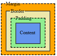
Pretty much every visible element contains four "layers" of boxes, they are from inner most to outer most:
- Content: The actual content of the element.
- Padding: The space between the content and the border.
- Border: The line that goes around the box.
- Margin: The space outside the box.
In the next several lessons, we will be covering these concepts in more detail. For now, here is an image illustrating the box model:
How Layers Change Size
Assume for a moment we have a div with the class set to "card" with this style:
.card {
  width: 300px;
  padding: 16px;
  border-width: 2px;
  margin: 24px;
}
Even though we explicitly set the width to 300 pixels, the total width that the box takes up will be more. This is because the padding, border, and margin are all included. We actually wind up with an element that takes up this much width:
Using this equation, the card's overall width would be 384 pixels.
Note: The same principle applies to the height.
Why This Matters
Back in the Display lesson, I show an example of setting up a navigation using a combination of inline-block and percentages for the width. However, if you noticed, adding up all the percentages did not equal 100%.
The reason for this is because elements have default values for their margin and padding and if we do not account for the box model then using percentages that add up to 100% would cause the items to overflow to the next line.
Demo
Open the demo in a new tab
WhItEsPaCe
Notice how the third example from above is the one that does not overflow at all. The reason for this is because of the whitespace inside the HTML.
Remember that HTML collapses whitespace down into a single whitespace character. This little character is enough to mess with the box model.
Whitespace is a real pain to deal with because it's one of those things that is easily forgettable but can cause dramatic changes in expected behavior.
Padding
Description
Padding is the space that goes in between the content and the border.
If you think in terms of a painting that is hung on the wall, padding is sort of like the mat inside the frame that separates the painting itself from the edges of the frame.
The padding property is what makes content feel less cramped and more readable.
Syntax
The padding property actually consists of four properties:
- padding-top
- padding-right
- padding-bottom
- padding-left
You can set these individually if you want, for example:
my-element {
  padding-bottom: 5px;
  padding-left: 25px;
  padding-right: 25px;
  padding-top: 10px;
}
Alternatively, you can use a shorthand syntax to set them all the same value using:
my-element {
  padding: 15px;
}
There is an alternative where you can set two or three of the properties using the shorthand syntax, but personally I find it confusing and I'm not going to spring that on you.
Gotchas
Here are some rules and gotchas that you must abide by when setting the padding:
- You cannot have negative padding.
- Padding will affect backgrounds.
- Padding affects inline elements differently than block elements.
- Large padding can make your web page look like garbage, I recommend sticking with relative units when using padding (like em and rem).
Demo
Open the demo in a new tab
Borders
Description
Borders represent the divider between the padding and the margin. Going back to the painting that's hung on the wall, the border property would represent the frame.
The border property is actually comprised of 3 separate properties:
- border-width: The thickness of the border.
- border-style: The apperance of the line.
- border-color: The color of the border.
Border Width
The border-width property represents how thick the border will be and can either be measurement units -or- these keywords:
- thin
- medium
- thick
For example:
.border-fixed {
  border-width: 1px;
}
.border-relative {
  border-width: 1rem;
}
.border-thin {
  border-width: thin;
}
.border-medium {
  border-width: medium;
}
.border-thick {
  border-width: thick;
}
Demo
Open the demo in a new tab
Border Style
The border-style property represents how the border will look using one of these keywords:
- solid
- dotted
- dashed
- double
- groove
- ridge
- inset
- outset
- none (default)
- hidden
For example:
.border-solid {
  border-style: solid;
}
.border-dotted {
  border-style: dotted;
}
.border-dashed {
  border-style: dashed;
}
.border-double {
  border-style: double;
}
.border-groove {
  border-style: groove;
}
.border-ridge {
  border-style: ridge;
}
.border-inset {
  border-style: inset;
}
.border-outset {
  border-style: outset;
}
.border-none {
  border-style: none;
}
.border-hidden {
  border-style: hidden;
}
Demo
Open the demo in a new tab
Side-Specific Properties
A useful feature of borders is that you can style a specific side of an element without touching any of the other sides. The side enumerations are:
- bottom
- left
- right
- top
The syntax would follow: border-{side}-{property}.
So for example, if you wanted to set the width of every border to 2 pixels, but have the left and right sides yellow and have the bottom dotted, then you would do:
my-element {
  border: 2px;
  border-left-color: green;
  border-right-color: green;
  border-style: solid; /* all sides */
  border-bottom-style: dotted; /* just the bottom */
}Note: keep in mind that the ordering matters, whatever property appears last will take precendence. In the example above, if we swapped the last two properties around, then the bottom side won't be dotted because the border-style (for all) would take precendence.
Border Radius
The last property I wanted to go over that doesn't necessarily change the box model but is useful nonetheless is the border-radius property.
The border-radius property is how the corners of an element are rounded.
This can be set to any measurement unit and either apply to every corner or only specific corners.
If you want to set the radius for a specific corner, the top/bottom will come before left/right:
- border-top-left-radius
- border-top-right-radius
- border-bottom-left-radius
- border-bottom-right-radius
Here is an example of setting the radius of every corner except the bottom right:
my-element {
  border-radius: 10%; /* every corner */
  border-bottom-right-radius: 0; /* just the bottom/right corner */
}
Demo
Open the demo in a new tab
Exercise
Use the following markup:
<!DOCTYPE html>
<html lang="en">
  <head>
    <title>CssLessons - Border Radius Demo</title>
    <meta charset="UTF-8" />
    <meta name="viewport" content="width=device-width, initial-scale=1.0" />
  </head>
  <body>
    <h1>Border Exercise Demo</h1>

    <div>
      <button>First</button><button class="middle">Middle</button><button>Last</button>
    </div>
  </body>
</html>
With this markup:
- Make each button appear on the same line with equal width.
- Each button should have a unique background color.
- Give the buttons some padding to make them more user-friendly.
- The first and last button should have a border-width of 1 pixel.
- The first button should have rounded left corners and no right border at all.
- The middle button should a double border.
- Note: I'm not trying to trick you, but you will need to bump up the border-width for the middle button.
- This is because a width of 1 pixel is not enough to show the double borders.
- The last button should have rounded right corners and no left border at all.
Example
Open the example in a new tab
Solution
Show Example Code
div button {
  border-width: 1px;
  display: inline-block;
  padding-bottom: 0.5rem;
  padding-top: 0.5rem;
  width: 33%;
}
div :first-child {
  background-color: rebeccapurple;
  color: white;
  border-right-width: 0px;
  border-bottom-left-radius: 0.5rem;
  border-top-left-radius: 0.5rem;
}
div .middle {
  border-bottom-style: double;
  border-bottom-width: 4px;
  border-top-style: double;
  border-top-width: 4px;
}
div :last-child {
  background-color: gold;
  border-left-width: 0px;
  border-bottom-right-radius: 0.5rem;
  border-top-right-radius: 0.5rem;
}
Click on the "Show Example Code" above to see one way to solve the exercise.
Margin
Description
Margin represents the space outside the element. Using the same paint example from earlier lessons, this would kind of represent the gap between picture frames assuming you have several pictures hung up.
In this lesson, I'm not really going to go over the syntax of margin because it's identical to padding, part of why they're easy to confuse.
Margin vs Padding
Because margin and padding look similar on the screen, they're very easy to mix up. A quick way to think about it:
- Padding = space inside the element (between content and border).
- Margin = space outside the element (between the border and other elements).
Visually they both "add space", but they live in different layers of the box model:
- Padding pushes the border away from the content.
- Margin pushes other elements away from this element.
- Background colors stop at the border, so they fill padding but do not fill margin.
Margin Collapsing
Marins have a fun behavior (and by fun I mean incredibly annoying) called margin collapsing.
When two vertical margins touch, instead of adding together, the browser will usually use the larger of the two.
For example, assume we have the following:
/* css defined somewhere */
.p {
  margin-bottom: 1rem;
  margin-top: 1rem;
}

<!-- html defined in document -->
<p>Paragraph 1</p>
<p>Paragraph 2</p>
In this case, even though each paragraph has 1rem on the top and bottom, the total space is not actually 2rem, CSS will collapse them down to 1rem.
Flexbox Overview
Description
Up to this point, most of our layouts have flowed one element after another, top to bottom. That's fine for simple pages, but it can quickly get a bit hairy. For example, remember how in the Box Model Overview lesson that whitespace effected the navigation example?
This is where the flexible box layout module, or flexbox, comes in. Flexbox is a layout system in CSS that makes it easier to customize element alignment.
Instead of manually calculating widths, margins, and playing "layout Jenga", Flexbox lets you describe how items should behave then lets the browser do the heavy lifting.
After all, we're developers. The only heavy lifting I do is when I bring my coffee to my mouth.
Contains And Items
Flexbox always starts with a container and when you specify that an element is a flexbox container, then all of its immediate children become flex items.
For example, given this markup:
<article class="cards">
  <section>Card 1</section>
  <section>Card 2</section>
  <section>Card 3</section>
</article>
We can turn the article.cards element into a flex container like this:
.cards {
  display: flex;
}
And now that the element is a flex container every section will be a flex item.
When To Use Flexbox
Flexbox is best when you are laying out items in one direction at a time, for example:
- Navigation menus.
- Toolbars or button groups.
- Centering content both horizontally and vertically.
- Simple responsive layouts that rearrange on smaller screens.
When you need full two-dimensional layouts (both rows and columns at the same time), then CSS Grid is often a better choice, but that's a topic for another chapter.
Flexbox Model
Description
In the Flexbox Overview lesson we talked about what Flexbox is and how it lines things up in a row or column. In this lesson, we're going to zoom in on how the flexbox model thinks about sizing and spacing.
Good news! The regular box model (content, padding, border, margin) still applies. Flexbox doesn't replace it, it just changes how the browser decides the size and position of elements inside a flex container.
Recap
In the regular block layout, an element's size is mostly controlled by its own properties:
- Width and height.
- Padding, border, and margin.
- The content inside.
The browser then stacks elements vertically and lets them take up as much horizontal space as they can (for block elements).
With Flexbox:
- The container decides how to distribute space.
- The items can grow or shrink to fit that space.
- Margins still matter, but they are handled a bit differently.
You can think of Flexbox as a "smarter box model" for a group of items inside a container.
Flex Direction
The flex-direction property is how you specify what axis the flex items will flow and there are two acceptable values:
- row (default)
- column
When the flex-direction is set to "row" (or unspecified) then the items will flow from left to right whereas when the flex-direction is set to "column" then the items will flow from top to bottom.
For example:
.flex-row {
  display: flex;
  flex-direction: row;
}

.flex-col {
  display: flex;
  flex-direction: column;
}
Notice that we still specify that the display is flex. The flex-direction as well as all the other flex specific properties are useless without the display being set to flex.
Sizing
When the browser lays out flex items, it roughly follows this mental model:
- Figure out each item's base size.
- Compare the total of those base sizes to the space available in the container.
- If there is extra space, distribute it.
- If there is not enough space, take some away.
Base Size
An item's base size is basically its "starting point" before growing or shrinking. It can come from:
- flex-basis if set to a value other than "auto".
- Otherwise the main size property, which is the width if displayed in a row and the height if displayed in a column.
- If all else fails, then it uses the content's size like how it'd be in a normal box model layout.
Here is an example demonstrating how the base size would be calculated
.flex1 {
  display: flex;
}
  .flex1 > .flex-basis {
    flex-basis: 200px; /* base size = 200px */
  }

.flex2 {
  display: flex;
  flex-direction: row; /* base size will use width */
}
  .flex2 > .row-size {
    height: 200px;
    width: 150px; /* base size = 150px */
  }

.flex3 {
  display: flex;
  flex-direction: column; /* base size will use height */
}
  .flex3 > .column-size {
    height: 200px; /* base size = 200px */
    width: 150px;
  }

.flex4 {
  display: flex;
}
  .flex4 > .default {
    /* base size comes from the content */
  }
Margins, Padding, and Gaps in Flexbox
The individual box model layers still apply, but there are a few Flexbox specific quirks to be aware of.
Padding and Borders
- Padding and borders are still part of each item's box, just like before.
- The flex "main size" includes content + padding + border (and margins add extra space around items).
- Padding does not change how Flexbox distributes free space, but it changes how much space each item needs.
Margins
- Horizontal/vertical margins are added between flex items.
- Vertical margin collapsing does not occur between flex items.
- margin: auto on a flex item has special behavior and can be used to push items apart (e.g., one item to the far right).
For example, the following would force the last item to be all the way to the right of the container:
.flex {
  display: flex;
}

.flex :last-child {
  margin-left: auto;
}
Gap
Flexbox also has a dedicated spacing property: gap.
- The gap property adds space between flex items, but not at the edges of the container.
- It's often easier and cleaner than maintaining margins on each item.
.toolbar {
  display: flex;
  padding: 0.5rem;
  gap: 1rem;
}
Alignment
Another big part of flexbox is how it aligns items inside the container. There are three properties that help with alignment:
- justify-content: distributes items along the main axis.
- align-items: aligns items along the cross axis.
- align-content: aligns multiple rows/columns of items.
Common values you'll use a lot:
- flex-start: pack items toward the beginning.
- center: center the items.
- flex-end: pack items toward the end.
- space-between: first item at the start, last at the end, others spread out in between.
- space-around and space-evenly: distribute space more evenly around items with slightly different strategies.
For example:
.nav {
  display: flex;
  justify-content: space-between;
  align-items: center;
}
Demo
Here is a simple example showing how the flexbox model distributes space between three items with different base sizes:
<section class="flex-model-demo">
  <div class="box small">Small</div>
  <div class="box medium">Medium</div>
  <div class="box large">Large</div>
</section>
.flex-model-demo {
display: flex;
padding: 1rem;
gap: 1rem;
border: 1px solid gray;
}
.box {
padding: 1rem;
background-color: rebeccapurple;
color: gold;
}
.box.small {
flex-basis: 10%;
}
.box.medium {
flex-basis: 30%;
}
.box.large {
flex-basis: 60%;
}
.flex-model-demo .box {
flex-grow: 1;
}In this demo:
- Each box has a different base size.
- Then, because of flex-grow: 1 to all of them, they share any extra space equally.
- Padding and the gap still come from the box model and spacing properties.
Open the demo in a new tab
Flexbox Playground
While I have personally used flexbox quite a lot throughout my experience as a web developer, I still find it difficult to mentally keep track of how my flex container will arrange the items when I'm tinkering with the properties.
Luckily for us there are many resources out there that allow you to virtually "play" with the flexbox model.
I would highly recommend checking out one of the playgrounds (or some people call them sandboxes):
Exercise
Use the following HTML:
<!DOCTYPE html>
<html lang="en">
  <head>
    <title>CssLessons - Flexbox Model Exercise</title>
    <meta charset="UTF-8" />
    <meta name="viewport" content="width=device-width, initial-scale=1.0" />
  </head>
  <body>
    <main>
      <header>
        <h1>CssLessons Flexbox Model Exercise</h1>
      </header>

      <section class="pricing">
        <article class="plan basic">
          <h2>Basic</h2>
          <p>Good for getting started.</p>
        </article>

        <article class="plan pro">
          <h2>Pro</h2>
          <p>Better for serious work.</p>
        </article>

        <article class="plan ultimate">
          <h2>Ultimate</h2>
          <p>For when you want it all.</p>
        </article>
      </section>
    </main>
  </body>
</html>
With this markup:
- Turn the .pricing section into a flex container that lays out the plans in a row.
- Give each .plan some padding and a border so you can clearly see the boxes.
- Use gap to add space between the plans instead of margins.
- Set a base size for each plan using flex-basis so that:
- .basic and .ultimate start at 25% wide.
- .pro starts at 50% wide.
- Allow all three plans to grow equally if there is extra space in the container.
- Center the row of plans horizontally inside the .pricing section using Flexbox alignment.
Example
Open the example in a new tab
Solution
Show Example Code
.pricing {
  display: flex;
  justify-content: center; /* center */
  gap: 1.5rem; /* space between plans */
  padding: 2rem 1rem;
}

.plan {
  border: 1px solid #ccc;
  padding: 1.5rem;
  background-color: #FFF5EE;
  flex-grow: 1; /* share extra space equally */
}

/* shared base sizes */
.plan.basic,
.plan.ultimate {
  flex-basis: 25%;
}

/* slightly larger base sizes */
.plan.pro {
  flex-basis: 50%;
}
Click on the "Show Example Code" above to see one way to solve the exercise.
Flexbox Wrapping
Description
Flexbox will try to fit all items on one line by default, even if it means shrinking them down until they become minuscule and unusable.
The flex-wrap property gives you control over what happens when there isn't enough room.
Flex-Wrap Properties
The following are the available flex-wrap properties:
- no-wrap: (default) all items stay on the same line.
- wrap: items will wrap onto a new line when there isn't enough room.
- wrap-reverse: same as wrap, but the new lines will appear above (for rows) or to the left (for columns).
As a quick side note, I don't think that I have ever used wrap-reverse.
For example:
.flex-wrap {
  display: flex;
  flex-wrap: wrap;
}
How It Affects Layouts
Once items wrap, flexbox treats each line almost like its own "mini flex container" for alignment.
When a flexbox can be wrapped, it also allows for the use of the align-content property too:
.flex-wrap {
  display: flex;
  flex-wrap: wrap;
  align-content: space-around;
}
Note: align-content will do absolutely nothing unless items are wrapped and there is extra space.
Demo
Open the demo in a new tab
In this example, every div that is a child of a flex container has a width of 35%, but because the first container doesn't have wrapping, all the items get bunched together.
Flexbox Items
Description
Just like the flex container can apply styles that affect the items within the container, there are various CSS properties that allow for the individual flex items to be styled without touching their sibilings.
Some of these properties are:
- align-self: similar to align-content, only for the individual item.
- justify-self: similar to justify-items, only for the individual item.
- flex-grow: ratio used to fill the remaining space.
- flex-shrink: ratio used to shrink relative to the rest of the items.
- flex-basis: which we've already covered in the flexbox model lesson.
Align Self
The align-self property is identical to the align-items, only instead it gets applied to the individual flex item instead of every item in the container.
It accepts the same values as the align-items property, along with some others which include:
- center
- flex-start
- flex-end
- baseline
- first baseline
- last baseline
- stretch
Demo
Open the demo in a new tab
Justify Self
Just like with the align-self property, the justify-self property is identical to the justify-items property, only being applied to the individual flex item.
You can even use the same values shown above too.
Flexbox Exercise
Keep It Up
Before I give you the exercise, I wanted to stop and say how proud I am of you. Taking the time to learn something new, especially coming from me, is always hard. Continue to put in the effort, I believe in you!
Now this exercise it to really put together many of the concepts you should have learned so far and may feel like it is too much. The important thing to remember is that you have already learned all this stuff, it's just a matter of putting it all together.
Be sure to take your time and try to tackle one requirement at a time.
Task
Use the HTML template below:
<!DOCTYPE html>
<html lang="en">
<head>
<title>CssLessons - Flexbox Exercise</title>
<meta charset="UTF-8" />
<meta name="viewport" content="width=device-width, initial-scale=1.0" />
</head>
<body>
<header>
<h1>CssLessons Flexbox Exercise</h1>
<nav>
<ul>
<li><a href="#">Home</a></li>
<li><a href="#">Blogs</a></li>
<li><a href="#">About</a></li>
</ul>
</nav>
<h2>Blogs</h2>
</header>
<div>
<aside>
<div class="blog-item">
<h3>Sep. 8th, 1989</h3>
<p>Silly. Willy.</p>
<p><a href="#">View Blog</a></p>
</div>
<div class="blog-item">
<h3>Jan. 11th, 1926</h3>
<p>Strong. Silent. Nuclear.</p>
<p><a href="#">View Blog</a></p>
</div>
<div class="blog-item">
<h3>July 11th, 1996</h3>
<p>Behold... THE POWER!</p>
<p><a href="#">View Blog</a></p>
</div>
</aside>
<main>
<h3>Sep. 8th, 1989</h3>
<h4>Silly. Willy.</h4>
<p>Lorem ipsum dolor sit amet, consectetur adipiscing elit. Aliquam ullamcorper mi eget varius sodales. Cras ut turpis vestibulum eros ullamcorper rutrum. Integer efficitur mauris nibh. Aenean viverra tortor lacus, vitae ultrices arcu tempus ut. Morbi facilisis vitae leo non luctus. Pellentesque habitant morbi tristique senectus et netus et malesuada fames ac turpis egestas. Donec mattis arcu metus, nec hendrerit tellus fermentum varius. Nunc nec turpis vel leo faucibus placerat a quis mi. Fusce in enim dictum, rhoncus turpis nec, volutpat lorem. Fusce gravida augue eget orci cursus hendrerit. Vestibulum aliquet porta lacus, in lobortis sem pulvinar a. Fusce scelerisque est in dapibus accumsan. Praesent et neque vestibulum, sodales mi vitae, sollicitudin nibh. Duis convallis faucibus enim, at interdum turpis vulputate condimentum. Nulla facilisi. Donec dignissim, nisi quis hendrerit maximus, nunc elit dignissim augue, et tempor elit lorem eget orci.</p>
<p>Aenean congue quam vitae nulla tincidunt, ac pretium nisl convallis. Nunc tincidunt ante sagittis, euismod erat et, vehicula massa. Morbi ut leo fermentum, pharetra ligula sed, pulvinar ligula. Praesent eu pellentesque ex. Nulla luctus nec metus id eleifend. Maecenas a mattis leo. Nunc tincidunt nisl sit amet orci varius, ac porta dolor sodales. Morbi nibh nisl, efficitur ac purus eu, elementum ultricies felis. Sed eget consectetur elit. Sed mollis arcu massa, ac tempor leo tristique a.</p>
<p>Aliquam scelerisque lectus quam, semper efficitur erat posuere ac. Ut mollis nisi tortor, eu congue arcu aliquam cursus. Quisque consequat ante tellus, eget vehicula lorem pretium ac. Suspendisse potenti. Lorem ipsum dolor sit amet, consectetur adipiscing elit. Phasellus sit amet dui bibendum, ullamcorper ligula eu, ultricies dui. Class aptent taciti sociosqu ad litora torquent per conubia nostra, per inceptos himenaeos. Nunc nec tortor ac ante tristique sodales vel nec sem. Vivamus vehicula vestibulum diam in faucibus. Sed non cursus diam, in pharetra ex. Duis non risus pulvinar, congue neque nec, iaculis neque. Cras lobortis porttitor erat, quis tristique nulla condimentum non. Donec nisl nunc, malesuada tincidunt laoreet suscipit, viverra vitae nulla. Curabitur in massa sed risus fringilla fermentum eget non enim. Integer at semper lectus. Donec auctor fringilla augue, a lacinia mi feugiat in.</p>
</main>
</div>
<footer>
<p>© 1991</p>
</footer>
</body>
</html>With it, I want you to build a variation of the famous "holy grail" layout following these specifications:
- Setup the body.
- Make the body a flex container.
- Make the content flow top to bottom.
- Make the body's height 100 percent of the device's height.
- Build the header.
- The header's heading elements should be centered.
- The header should have a soft background color.
- Build a global navigation.
- This will be the header's nav element.
- Make it so that each element takes up equal width.
- There should be a vertical divider between the items without any at the ends.
- The links should be clickable anywhere within the list item's "box".
- The links should not be flush against the list item's edges.
- The links should have a slightly darker background color than the header.
- Build the side menu.
- The aside element should take up 20% of the device's width whereas the main element should fill the remainder.
- The aside element should have a border to the right.
- The child elements should not be flushed against the list item's edges.
- Build the cards.
- The .blog-items represent cards.
- Each card should have a background color.
- Each card should have slight padding.
- All but the last card should have a bottom border.
- There should be space between card.
- Build the main content.
- The main element should not have the contents touch the sides.
- The paragraphs within the main content should have more space between each line than the default.
- The first paragraph should be indented.
- Build the footer.
- The footer element appear at the very bottom.
- The footer should have a border to its top.
- The content should be centered.
- The footer should have a very dark background color with a lighter text color.
Demo
Open the demo in a new tab
Solution
Show Example Code
body {
  display: flex;
  flex-direction: column;
  height: 100vh;
}

body > header {
  background-color: lightgoldenrodyellow;
}

body > header > nav > ul,
body > div {
  display: flex;
}

body > header > nav > ul > li {
  background-color: goldenrod;
  flex-grow: 1;
  list-style-type: none;
}

body > header > nav > ul > li + li {
  border-left: 1px solid black;
}

body > header > nav > ul > li > a {
  display: block;
  padding: 0.5rem;
}

body > header > h1,
body > header > h2,
body > header > nav > ul > li,
body > footer {
  text-align: center;
}

body > div {
	flex-grow: 1;
}

body > div > aside {
  border-right: 1px solid black;
  flex-basis: 20vw;
  flex-grow: 0;
  flex-shrink: 0;
  padding: 1rem;
}

body > div > aside > div.blog-item {
  border-bottom: 1px solid black;
  background-color: lightcyan;
  border-top-left-radius: 10px;
  border-top-right-radius: 10px;
  padding: 0.5rem;
  margin-bottom: 0.25rem;
}

body > div > aside > div.blog-item:last-child {
  border-bottom-width: 0px;
}

body > div > main {
  flex-grow: 1;
  padding: 1rem;
}

body > div > main > p {
  line-height: 1.25;
}

body > div > main > p:first-of-type {
  text-indent: 1rem;
}

body > footer {
  background-color: rebeccapurple;
  border-top: 1px solid black;
  color: gold;
}
Click on the "Show Example Code" above to see one way to solve the exercise.
Trick Or Treat
Don't be surprised if you came up with something different than my solution, but the results look the same.
CSS is a very powerful and flexible language. You could probably even do this without leveraging the flexbox, though admittedly it would be much harder.
As you continue to practice, you will start to develop your own style (pun intended). The important thing is that you keep on practicing!
Grid Overview
Description
Up to now, we've mostly worked in one dimension at a time. The box model gave us control over individual elements, and Flexbox helped us line things up in a row or a column. But what if you want to control both rows and columns at the same time? That's where the CSS Grid Layout module (usually just called "Grid") comes in.
Instead of nudging things around with margins and floats, you can say things like "this element should span the first two columns" or "this goes in the header area" and have the browser handle the positioning for you.
Grid vs Flexbox
Grid and Flexbox are both layout systems, but they specialize in doing different jobs:
- Flexbox is best for one-dimensional layouts.
- Grid is best for two-dimensional layouts.
If you're laying out a navigation bar, a button group, or a single row of cards, then flexbox is perfectly fine. If you're laying out an entire page or a complex component, Grid can make your life so much easier.
Core Concepts
There are a couple of terms you'll see when working with Grid:
- Grid container: the element whose display is set to grid or inline-grid.
- Grid items: the container's direct children.
- Tracks: the rows and columns of the grid.
- Grid lines: the lines that separate the tracks.
- Grid cells: one "box" where a row and column intersect.
- Grid areas: a rectangular group of one or more cells.
Don't worry about them too much just yet because we'll go through each concepts in more detail in future lessons.
A Tiny Example
Here is a very small example of turning a div into a grid and defining some tracks:
<section class="meow">
  <div>X</div> <div>X</div> <div>O</div>
  <div>O</div> <div>X</div> <div>X</div>
  <div>X</div> <div>O</div> <div>O</div>
</section>
.meow {
display: grid;
grid-template-columns: 1fr 1fr 1fr;
grid-template-rows: auto auto auto;
gap: 1rem;
text-align: center;
}In this example, we created a tic-tac-toe grid where each column takes up a third the available space, and we added a little gap between the cells.
Side note, is my family the only one that calls a draw in tic-tac-toe a "cat"?
Grid Container
Description
Just like Flexbox, every Grid layout starts with a container. When you turn an element into a grid container, all of its direct children become grid items.
You do this by setting the display's property to grid. For example:
my-element {
  display: grid;
}
Defining Rows and Columns
The main properties for defining the grid structure are:
- grid-template-columns: defines the columns.
- grid-template-rows: defines the rows.
For example:
.cards {
  display: grid;
  grid-template-columns: 200px 1fr 1fr;
  grid-template-rows: auto auto;
}
This creates:
- Three columns: the first is 200px wide, the other two share the remaining space.
- Two rows whose heights automatically grow to fit their content.
Gaps Between Items
Grid has built-in spacing using the gap property (you might also see row-gap and column-gap):
.cards {
  display: grid;
  grid-template-columns: 1fr 1fr;
  grid-template-rows: auto auto;
  gap: 1rem; /* space between cells */
}
Using gap is generally cleaner than putting margins on each individual item. Could you imagine having to maintain the margins for a bunch of elements, then what if the structure changes? Using gap just makes it so much easier.
Grid Tracks
Description
Grid tracks are the rows and columns that define the structure of your layout. Once you understand how to size tracks, Grid starts to feel much easier to use.
In this lesson, we'll talk about track sizing, the fr unit, and some incredibly handy helper functions like repeat and minmax.
Basic Track Sizes
You can use the measurement units already discussed in the units of measurement lesson or either of these to define tracks:
- auto - size based the remaining space
- fr - a grid specific fraction unit
Example:
.layout {
  display: grid;
  grid-template-columns: 200px 1fr 2fr;
  grid-template-rows: auto 300px;
}
Here, the columns work like this:
- First column: fixed 200px.
- Second column: one share of the leftover space.
- Third column: two shares of the leftover space.
The fr unit is only concerned with the space that's left over after fixed/auto tracks are accounted for.
The repeat() Function
If you find yourself writing the same pattern over and over, Grid has a function to do this for you: repeat().
Instead of this:
.scrub {
  display: grid;
  grid-template-columns: 1fr 1fr 1fr 1fr 1fr;
}
You can write:
.fly-guy {
  display: grid;
  grid-template-columns: repeat(5, 1fr);
}
Both produce the same thing, it's just less typing and fewer chances to make a typo using the repeat method.
minmax
The minmax() function lets you define a range for a track size:
.cards {
  display: grid;
  grid-template-columns: repeat(3, minmax(200px, 1fr));
}
In this example, each column:
- Won't get smaller than 200px.
- Can grow up to a flexible 1fr to share remaining space.
This is great for making grids that are flexible but don't shrink down to basically nothing.
Grid Items
Description
Grid items are the direct children of a grid container. Once you have a grid defined, each item gets placed into grid cells and can be aligned, stretched, or centered inside those cells.
In this lesson, we'll focus on how items behave inside the tracks you've created.
Alignment
There are two main axes in Grid, just like with Flexbox:
- Inline axis: (left-to-right in English) - controlled by justify-* properties.
- Block axis: (top-to-bottom in English) - controlled by align-* properties.
At the container level, you can use:
- justify-items: how items are aligned in their cells horizontally.
- align-items: how items are aligned in their cells vertically.
- place-items: shorthand for align-items and justify-items together.
For example:
.grid {
  display: grid;
  grid-template-columns: repeat(3, 1fr);
  grid-template-rows: repeat(2, 150px);
  place-items: center; /* center both horizontally and vertically */
}
Self Care
Just like with Flexbox, individual items can opt out of the container's default alignment using:
- align-self: vertical alignment within the cell.
- justify-self: horizontal alignment within the cell.
- place-self: shorthand for both.
Example:
.grid > .special {
  align-self: end;
  justify-self: start;
}
Now that one item will sit in the bottom-left corner of its cell, even if the rest are centered.
Stretching
By default, grid items often stretch to fill the entire cell. This is controlled by align-items and justify-items:
- stretch: fill the cell (default).
- start: puts them to the left.
- center: puts them to the center.
- end: puts them to the right.
If you ever find a grid item is too tall or wide, check if the grid container is stretching its items. Nine times out of ten, this is cause.
Placement
Description
Once a grid is defined, the browser can place items automatically based on source order, but sometimes you want more control.
In this lesson, we'll look at how to place items in specific places.
Grid Lines and Numbers
Grid lines are the lines between rows and columns. They are numbered starting at 1. For example, if you have 3 columns, you have 4 vertical grid lines.
You can use these line numbers to place items.
A good example to think of would be a waterfall chart:
<div id="waterfall-chart">
  <div id="value1"></div>
  <div id="value2"></div>
  <div id="value3"></div>
</div>

#waterfall-chart {
  background-image: linear-gradient(to bottom, rgba(0, 255, 0, 0.25), rgba(255, 0, 0, 1));
  display: grid; /* displays grid */
  gap: 1rem; /* give it some cushion */
  grid-template-columns: repeat(3, 1fr); /* 3 equally sized columns */
  grid-template-rows: repeat(10, 1fr); /* 10 equally sized rows */
  height: 50vh;
  width: 50vw;
}

#value1 {
  background-color: green;
  grid-row: 1 / span 8; /* starts at row 1 and spans 8 rows */
}
#value2 {
  background-color: rebeccapurple;
  grid-row: 3 / span 3; /* starts at row 3 and spans 3 rows */
}
#value3 {
  background-color: gold;
  grid-row: 4 / span 7; /* starts at row 4 and spans 7 rows */
}
Open the demo in a new tab
Span
Notice how in the example above I'm using a span argument. Instead of always calculating the ending line number, you can use this nifty keyword to handle the work for you.
For example:
.card.wide {
  grid-column: span 2;
}
This example basically says: start where you were going to start, but span 2 columns. The browser will figure out the end line for you.
Auto Flow
Description
So far we've mostly told Grid exactly where to put things. But the grid layout can also automatically place items for you based on their order.
The grid-auto-flow property controls how the browser automatically lays out items that don't have an explicit position.
Rows vs Columns
The two most common grid-auto-flow values are:
- row: (default) fill rows left to right, then wrap to the next row.
- column: fill columns top to bottom, then move to the next column.
Example:
.auto-grid {
  display: grid;
  grid-template-columns: repeat(3, 1fr);
  grid-auto-flow: row; /* default, but shown for clarity */
}
If you changed that to column, items would fill downwards first instead.
Implicit Tracks
If there aren't enough rows or columns defined to hold all the items, Grid will create new tracks for you. These are called implicit tracks.
You can control their size with:
- grid-auto-rows: for implicit rows.
- grid-auto-columns: for implicit columns.
For example:
.calendar {
  display: grid;
  grid-template-columns: repeat(7, 1fr); /* explicit columns */
  grid-auto-rows: 4rem; /* implicit rows have consistent height */
}
Think about a calendar for a moment. There are typically 4 weeks in a month, but sometimes it needs to show more than 4 weeks because the first day of the month falls on a day other than the start day of the week.
In this situation, we could explicitly define the 4 rows and their behavior but then add behavior for any auto rows that may need to be shown depending on the month.
Get Packing!
There is also a dense keyword you can use:
.auto-grid {
  display: grid;
  grid-template-columns: repeat(4, 1fr);
  grid-auto-flow: row dense;
}
With dense, Grid will try to back-fill any gaps left by items that span multiple tracks.
I'm not going to lie, I might have used dense once or twice, it's nothing something used very often. I'm only including it so that you're aware of it.
Template Areas
Description
Grid template areas let you describe your layout almost like ASCII art. Don't know what ASCII art is? Cool, let me show you!
   ___  __  __    __
  / __\/ _\/ _\  / /  ___  ___ ___  ___  _ __  ___
 / /   \ \ \ \  / /  / _ \/ __/ __|/ _ \| '_ \/ __|
/ /___ _\ \_\ \/ /__|  __/\__ \__ \ (_) | | | \__ \
\____/ \__/\__/\____/\___||___/___/\___/|_| |_|___/
Totally irrelevant to the material, but I love a good ASCII art.
Basically what you do is define areas with specific names in your grid, then assign items to those areas. It can make your CSS read more like a wireframe which is super helpful for non-developers.
Areas
Start by defining the rows and columns, then add grid-template-areas with a name for each row:
.page {
  display: grid;
  grid-template-columns: 200px 1fr;
  grid-template-rows: auto 1fr auto;
  grid-template-areas:
    "header header"
    "sidebar main"
    "footer footer";
}
Each quoted string is a row. The names inside the string are the areas. Repeating the same name across multiple cells makes that area span those cells.
Notice how this has a layout similar to the flexbox exercise, the difference is that it is much more obvious what area is being represented and how it should be laid out.
Assigning Items to Areas
Once you've defined your areas, you can assign elements to them using the grid-area property with a name:
header {
  grid-area: header;
}

aside {
  grid-area: sidebar;
}

main {
  grid-area: main;
}

footer {
  grid-area: footer;
}
Now you can move large chunks of layout around by rearranging the grid-template-areas, without touching the HTML.
Empty Cells
If you want to leave a cell empty in the template, you can use a dot. For example:
.page {
  display: grid;
  grid-template-columns: 200px 1fr;
  grid-template-rows: auto 1fr auto;
  grid-template-areas:
    "header header header"
    "sidebar main ."
    "footer footer header";
}
In this case, the first and last row take up all three columns but the second row only takes up the first two columns with the third being empty.
Rules
- Each named area must form a perfect rectangle, i.e., no L-shapes (this ain't Tetris).
- The same area name must appear in a contiguous block.
- All rows in grid-template-areas must have the same number of cells.
If you break one of these rules, the browser will call you stupid then ignore the entire template.
Grid Exercise
Play Around
There's no getting around it. The Grid layout module is an absolute beast. Similar to the flexbox model, there are some playgrounds out there and I would highly recommend using them.
Here are just some that I've used before:
Get Out Of Jail Free Card
Consider this a "get out of jail free" card because I'm not going to make you complete an exercise from scratch on the grid layout.
Instead, what I would highly encourage that you do is to use one of the playgrounds listed above and try to accomplish different layouts.
This can be to make a waterfall chart, a column chart, a treemap chart. Or another alternative is to find a website that you like to use and replicate its layout.
The only way you will get better is by experience and just going out and building things.
Mobile First Overview
Description
We live in an era where the majority of internet traffic has shifted from people sitting down at a desktop and looking into a monitor to people glancing down at their smart phone while on the go.
It's a fact of life that the only thing ever constant is change and while CSS certainly wasn't developed with mobile devices in mind, it has adapted and is perfectly suitable to handle mobile styling.
How To Think
It's important to think in terms of a "mobile first" approach when styling websites. The general idea is that you setup your DOM so that it fits the smallest possible screen and then scales up, rather than aiming for a desktop and trying to scale down.
Keep in mind too that it's not just mobile devices we have to develop for now but also huge 4K televisions too in some cases.
What To Expect
In the next couple of lessons, you will learn how to take a mobile first approach using CSS.
Something to keep in the back of you mind is that at one point, early on in the days of the mobile explosion, it was recommended that you have two separate webpages: one for desktops and one for mobile devices with a "m." prefix in the URL.
This is no longer the case, if you see any information surrounding that, I would recommend completely ignoring it. Not only is it more efficient to have just a single web page, but its easier to maintain and it is SEO friendly.
Breakpoints
Description
Breakpoints are the building blocks of mobile-first design. They essentially represents sizes at which the layout "changes".
If you look at Bootstrap, one of the most popular 3rd party CSS libraries, they use the following breakpoints:
| Breakpoint | Dimension | Real World |
|---|---|---|
| Extra Small | <576px | Cell Phones |
| Small | >=576px | Tables |
| Medium | >=768px | Laptops |
| Large | >=992px | Monitors |
| Extra Large | >=1200px | 4K Monitors |
| Extra-Extra Large | >=1400px | Televisions |
With my experience of tinkering around with various breakpoints, I personally think that these breakpoints are generally the best for what they represent.
Media Queries
I will not go over every potential option, but media queries will conditionally apply styles based on a devices media type.
For instance, we can apply styles only when we are printing versus displaying content on a screen. For the purpose of these lessons, we will be using media queries to drive our breakpoints.
By using either min-width or max-width we can specify styles that are only applied based on the device's screen size. For example:
/* code defined outside media query */
my-element {
  display: flex;
  flex-direction: column;
}

@media (min-width: 768px) {
  /*
     code defined inside media query
	 this only gets applied to devices with widths >= 768px
  */
  my-element {
	flex-direction: row;
  }
}
What the example above does is say: have my content flow top-to-bottom on small screens but left-to-right on big screens.
Syntax
From the example above, I'm sure you can already tell a few things, but this is the basic syntax of a media query:
- @media: starts the media query.
- (condition): some condition to be met.
- In the example above we only have one condition.
- However, you can have multiple conditions like min-width and max-width.
- {: necessary curly bracket to start styling.
- - the styles applicable to the media query -
- }: necessary curly bracket to end styling.
Strategies
Typically, it's best practice to apply your breakpoints using min-width and assuming any styles outside of media queries are for mobile (or everything).
The reason for this is a bit complicated, but pixel calculating can kind of have unintended side-effects when using max-width.
Something I would strongly recommend doing too if you are working on a large project is to have your styles defined in separate files.
For example:
<link rel="stylesheet" href="/all-styles.css">
<link rel="stylesheet" href="/small.css">
<link rel="stylesheet" href="/medium.css">
<link rel="stylesheet" href="/large.css">
<link rel="stylesheet" href="/extra-large.css">
This will help you keep the various styles organized so that you know which device you're styling for based on the file you're editing.
General Approach
Description
As mentioned in the mobile first overview lesson, you generally want to style your pages from the smallest screen first to the largest screen last.
This means the first thing you write in your CSS should be the styles that work on all devices, with a particular emphasis on small screens such as phones. These are your "base styles."
As screens get wider, you enhance the features using breakpoints. This way, your code naturally grows with the device rather than trying to shrink a desktop layout down.
Base Styles
Your base styles are the foundation of your entire layout. They should be simple, flexible, and avoid fixed dimensions whenever possible.
Some common characteristics of mobile-first base styles include:
- A single-column layout
- Elements stacked vertically (top-to-bottom)
- Readable text sizes
- 100% or auto widths instead of fixed pixel widths
- Simple spacing using padding and margin
Here's a quick example showing a card layout before adding any breakpoints:
/* Base mobile-first styles */
.card {
  border: 1px solid #ccc;
  padding: 1rem;
  margin-bottom: 1rem;
}
Nothing in the example above assumes anything about the size of the device — which is exactly the point.
Enhancing With Breakpoints
Once you have your mobile layout established, you can decide when it makes sense to adjust your design for larger screens. This is where breakpoints come in.
With a mobile-first approach, you will almost always use min-width, like this:
@media (min-width: 768px) {
  .card-container {
    display: flex;
    gap: 1rem;
  }
}
In this example, once the screen reaches 768px or larger, the cards will be displayed side-by-side instead of stacked. Everything smaller than 768px keeps the simpler layout.
This is the key advantage of mobile-first CSS: smaller devices don't have to "override" anything. They only load what they need.
Practical Workflow
Here is a simple workflow you can follow when building with a mobile-first mindset:
- Start with your HTML structure and apply basic styles that look good on a small screen.
- Resize your browser window wider until something looks awkward or stretched.
- Add a min-width breakpoint at that point to fix the issue.
- Repeat the process, slowly increasing the browser width and adjusting the layout when necessary.
- Stop when the layout feels complete across typical screen sizes.
This approach helps you avoid unnecessary breakpoints and keeps your CSS minimal and intentional.
Exercise
Description
Assume for a moment that we are building a photo gallery, this case I'm going to hardcode the colors in the HTML (please don't judge).
We want this photo gallery to take a mobile-first approach by:
- Stack vertically on small screens (mobile).
- Display in 3 columns on devices that are at least 768px wide.
- Display in 5 columns on devices that are at least 992px wide.
Hint
If you can't think of how to setup the grid, then try to remember the flex basis and wrapping behaviors.
Markup
<!DOCTYPE html>
<html lang="en">
  <head>
    <title>CssLessons - Mobile First Exercise</title>
    <meta charset="UTF-8" />
    <meta name="viewport" content="width=device-width, initial-scale=1.0" />
  </head>
  <body>
    <h1>CssLessons Mobile First Exercise</h1>
    <div>
      <div style="background-color: black;">black</div>
      <div style="background-color: silver;">silver</div>
      <div style="background-color: maroon;">maroon</div>
      <div style="background-color: red;">red</div>
      <div style="background-color: purple;">purple</div>
      <div style="background-color: fuchsia;">fuchsia</div>
      <div style="background-color: green;">green</div>
      <div style="background-color: lime;">lime</div>
      <div style="background-color: olive;">olive</div>
      <div style="background-color: yellow;">yellow</div>
      <div style="background-color: navy;">navy</div>
      <div style="background-color: blue;">blue</div>
      <div style="background-color: teal;">teal</div>
      <div style="background-color: aqua;">aqua</div>
    </div>
  </body>
</html>
Demo
Open the demo in a new tab
Be sure to make your browser window smaller/larger to see the changes or use the device dev tool.
Solution
Show Example Code
body > div {
  display: flex;
  flex-wrap: wrap;
}
body > div > div {
  flex-basis: 100%;
}

@media (min-width: 768px) {
  body > div > div {
    flex-basis: 33%;
  }
}

@media (min-width: 992px) {
  body > div > div {
    flex-basis: 20%;
  }
}
Congratulations!

First off, I would like to say congratulations on completing every lesson. By this point you should have developed solid fundamentals that will make you a successfull programmer.
Now comes the big question: what should you do next?
Personally, I would recommend learning JavaScript. JavaScript allows users to interact with your website and it is so important with how we use the web today. Unfortunately, I haven't written tutorials for JavaScript just yet.
If you would like to start a different programming language, I do have a tutorial on Visual Basic .NET in the same style as this website. You can find that here: https://www.vblessons.com/.
Of course, I would have hoped you already went through my HtmlLessons website already.
Remember, programming is a "use it or lose it" skill. If you do not keep programming, as time goes by you will start to lose your edge. Whatever you decide to do going forward, I encourage you to continue programming and nevery shy away from asking for help.
In closing, if you are looking for a community to join full of nerds like myself, come on over to VBForums (opens in a new tab). I go by the handle dday9 and I hope to see you soon!